 |
This page is an archive. The contents have been moved from another page for reference purposes only, and should be preserved in their current form. Discussion or voting on this page is not current. Any additions you make will probably not be read.
|
D-Day
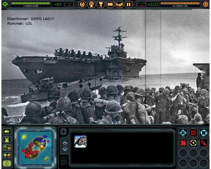
- The fleet crossing the English Channel into Normandy took forever to get there because all of the units on-screen took up too much bandwidth.
- Weren't the Allies on dialup? Try adding a few more icons to the unit box (there's only one there now, and I have no idea what it's supposed to be. That happens a lot). Sir Modusoperandi Boinc! 21:54, 26 May 2008 (UTC)
- Because it was made in the 1950's era. That suckx B.A.D. 71.145.151.114
Anne Frank
- Not sure if all that funny, or if it needs more work...also, would like some help with a caption.--Ithsword 19:47, 19 May 2008 (UTC)
- The face is a bit grainier than the rest of the pic. I don't know if your program has a grainifier, but if it does grainification, then try it on the rest of the pic. Sir Modusoperandi Boinc! 20:12, 19 May 2008 (UTC)
I burning your dog
/me cringes for expected reaction • • • Necropaxx (T) {~} 00:10, 7 May 2008 (UTC)
- The blur makes my brain hurt. The bottom half of the man, and the field are blurry? So, he's running (in standing position), while his body and the fire and the dog all move at the same speed. I like the concept of lighting family pets on fire, but this image could benefit if nobody in it was running. Except maybe the dog. Unless the dog is doing something else. That's up to you really. -- Brigadier General Sir Zombiebaron 00:21, 7 May 2008 (UTC)
- Agreed. Find a non blurry background and use that instead. De-blur the soldier's lower half as well; he doesn't need to be moving or appear to be moving for the image to work. -OptyC Sucks!
 CUN00:23, 7 May
- You really think the blur is bad? I thought it enhanced the whole speed element... You know, the camera's moving, motion blur... that sort of thing. Plus it's friggin' hard to find a pic of a dog running with no blur. • • • Necropaxx (T) {~} 00:38, 7 May 2008 (UTC)
- Chop the dog into a static background. The problem is that it looks like the camera should be still. The soldier is standing in a static pose (feet together and planted), blurring his legs just makes it look bad. Great concept though. -OptyC Sucks! CUN00:42, 7 May
- OK thanks! will do! • • • Necropaxx (T) {~} 00:57, 7 May 2008 (UTC)
- Betterer? • • • Necropaxx (T) {~} 20:54, 10 May 2008 (UTC)
- Much! -OptyC Sucks! CUN20:55, 10 May
Icebergs > ships
| Please Help this Picture
|
An iceberg eating a ship. I photoshopped this image with these 2 images i got from wikimedia commons: http:// upload.wikimedia.org/wikipedia/commons/b/b6/Iceberg_20_2000_08_12.jpg + http://commons.wikimedia.org/wiki/Category:Cruise_ships (i couldnt re-find it, but its somewhere on this list) as well as a few effects from MS paint to get the mouth looking like its eating the ship. Image credit: Nezlr
Nominate - discuss this image
|
|
~ NEZLR 


 22:50, 5 May 2008 (UTC)
- Do you still have the MSpaint window open? It might look better saved as a png (or as a jpg by another program). --monika 00:11, 6 May 2008 (UTC)
- addendum: I'd say the only two issues with it are the jpeg artifacts and the lack of a shadow/reflection for the boat, and the shadow/reflection issue would be best solved in photoshop, possibly detracting from the MSpaint charm. --monika 00:16, 6 May 2008 (UTC)
- What Mon said (Mon insists that I use that name). MSPaint does have its uses. Evil ones, mostly. Just remember to get GIMP or Photoshop if you plan to ever not do evil. Sir Modusoperandi Boinc! 03:14, 6 May 2008 (UTC)
The shadow will be added. it will still look like a JPG, but ill save it as a png. ~ NEZLR 03:54, 6 May 2008 (UTC)
- Eh, it's too late now then. The artifacts aren't that bad, and since they're already there, there's no benefit to the png format. It's a really cute picture, by the way. --monika 09:26, 6 May 2008 (UTC)
"Modern Pope"
. --Allahgator 00:13, 25 April 2008 (UTC)
- Well, for starters, go put a "baseball cap" on (backwards) and check yourself out in a mirror. Does your hair look the same as before the hat was put on? Probably. This, not so much. -- Brigadier General Sir Zombiebaron 00:27, 25 April 2008 (UTC)
- Thanks alot. I knew there's something wrong yea and its the hat. I'll try to work on this again and as you said will try a hat myself. ahh, I love this picture. Its there, almost. --Allahgator 20:26, 25 April 2008 (UTC)
- Haha! The Pope's head looks a bit big and I think has a slightly different contrast to the main image. Apart form that, awesome idea. -- Hindleyite Converse 18:57, 28 April 2008 (UTC)
- Thanks! Made the head a tad smaller and tried to play with the contrast but not sure if I got it right. --Allahgator 22:46, 29 April 2008 (UTC)
- I know there's something still wrong with the cap, umm, I tried fixing it but cant. --Allahgator 00:30, 30 April 2008 (UTC)
- Perhaps it would be easier to find a different photo of someone wearing a hat whose head is in the exact same position? That's generally what I do in these kinds of situations, even if having to give up on a particular source image sometimes makes me sad. --monika 00:44, 30 April 2008 (UTC)
Ivan Maiden
| Please Help this Picture
|
Think this is pretty good, want to know if/how it could be made better. I may throw this to the sharks at VFP if I get bored one day. Image credit: The UnIdiot
Nominate - discuss this image
|
|
Well, everyone is clearly from different sources when you look at it larger. Of particular concern is the guy who is second-from-right, he looks way messed up at any size. The light source is also very clearly coming from different places for a couple of them, the aforementioned guy included. Plus, at VFP, I'm sure at least some of the users wouldn't get it. I didn't.~~ Sir Ljlego, GUN [talk] 20:22, 22 April 2008 (UTC)
- That's a man named "Lenin", Lj. He was this really important character in this song by The Bealtes. Back In The Is A Warm Gun, or something. I agree though. Lenin and Putin look terrible. The top of Putin's head is too blurry. Lenin's head is at a very strange angle. The face between Lenin and Stalin (a Kzar...?) has some weird black outline above it. Oh, also, this is more of a "Oh, I see what's going on here." and less of a "Ha ha ha ha ha Russia!". In fact, much less of the latter. -- Brigadier General Sir Zombiebaron 00:32, 25 April 2008 (UTC)
Shroom Clouds
- I have no idea what this is. Does that help? Sir Modusoperandi Boinc! 03:30, 20 April 2008 (UTC)
It's supposed to be like drug mushrooms in a plastic bag, only they are mushroom clouds instead of mushrooms.RPBnimrod
- Ah. Try making them appear to be in the bag. Currently, they just look on it, which is silly. (copy the background bag pick and use it as a "lighten" mask over the original bag and the mushroom clouds, so that only its highlights will appear. Play around with its transparency) Also, lose the short, white ones (they look like hats). What's the brown stuff in the bag? Is that the drugs? Shouldn't it be just mushrooms in the bag? What, mushrooms are the drugs too?! Well, I never! Sir Modusoperandi Boinc! 17:58, 21 April 2008 (UTC)
- Well, the green stuff is actually catnip. I just wanted people to think when they saw it "hey look, drugs!". I'll work on the design, thanks for the reply!RPBnimrod
- I changed it up.RPBnimrod
Tylenol Rapid Death
| Please Help this Picture
|
I want to post this on VFP, but I know that I could get some advice to improve. HELP ME!
EDIT: I think that I fixed it up, how's it now? EDIT: I fixed it again, how is it now? Image credit: RPBnimrod
Nominate - discuss this image
|
|
- When 'chopping, try to make the edges of an image match the shape of that image. See the "edge" of the pill? It's all lumpy, rather than round at the ends, and flat on the sides. Instead of negative cutting (where you cut away everything that isn't the pill), try positive cutting. Select the circle select tool (or whatever it's called), select one end (where one hemisphere of the circle matches one end of the pill). Shift-select the same on the other end (so that it's masking both at the same time. Pick the lasso, or line-select tool and shift-select the flat parts. Now you've selected the entire pill, copy and paste as a new layer. Ta-da! No lumps. It may take some practice to pull off (Ctrl-Z is your friend). Good luck, if you're using a mouse. Mice suck. Sir Modusoperandi Boinc! 21:17, 18 April 2008 (UTC)
- It's closer, but the dark portions of the pill are too dark (it's outside under the sky, but it doesn't look like it is). Try playing with brightness/contrast until it looks like it was there in the first place. The top of the pill should be brighter (as it is facing the sky), and there's still some messy edging around it (the black band on the top). As for VFP, I'll warn you: I've been here for almost three weeks now, and I still have no idea what will do well there. Sir Modusoperandi Boinc! 06:46, 19 April 2008 (UTC)
- The Rapid Death doesn't look quite the same as everything else, see how it looks blurry. The land of make-believe doesn't believe in me:( 13:02, 26 April 2008 (UTC)
- It looks like a popsicle. 71.145.151.114 21:12, 7 June 2008 (UTC) (DJ Mixerr)
Basketball
- Play with the contrast of the basketballs so that they match the painting's faded tones better. Maybe add a hoop in the background. Also, on reefer desk we don't help with captions. We can't, that's caption desk's duty. Sir Modusoperandi Boinc! 22:23, 9 April 2008 (UTC)
- Not only the contrast, but also look for a filter (if you're not against that kind of thing) which puts it on a canvas, play with that a bit. Just an idea.-~~ Sir Ljlego, GUN [talk] 02:28, 10 April 2008 (UTC)
- And the bald guy on the right is beggin' for a red, white and blue sweatband! /me whistles Globetrotters' theme. Sir Modusoperandi Boinc! 04:39, 10 April 2008 (UTC)
- The Athens Globetrotters revolutionized Philosophy with their mad skillz.' or something like that would be a good caption, if I were suggesting such things.--<<
 >> 21:59, 19 April 2008 (UTC)
- The guy on the right's basketball looks like it should be falling, but isn't. Also, I agree with making the basketballs more faded. The land of make-believe doesn't believe in me:( 13:04, 26 April 2008 (UTC)
- I love this. Quite subtle but mildly hilarious! Also, we do need a caption desk. Something to do with a penalty shot off maybe? -- 18:59, 28 April 2008 (UTC)
Tom Cruise Cosmic Guidance Poster
| Please Help this Picture
|
Yet another ingenious follow-up invention to Scientologys exceptional E-meter. Tom Cruise leads the promotion in Central Europe and encourages people to start dealing with Cosmic Guidance (main article) as an innovative solution in everyday life situations. Image credit: BlackInkWriter
Nominate - discuss this image
|
|
I've potatochopped that again yesterday according to your wilde advices, but it was archived (What the--?). 'just wanted to know if it's OK. The red funnel is all shiny and "bling-bling" now, as you wisshhhhed. --BlackInkWriter 08:57, 5 April 2008 (UTC)
- I liked it better before. This is primarily because my calendar has "Mess with BIW's head" scheduled for today. Sir Modusoperandi Boinc! 22:20, 9 April 2008 (UTC)
- Unless you guys get terribly sick from looking at it (which I gladly consider the case), I'm either gonna leave it like that or revert it to the previous version. I liked the other one better as well, coz it doesn't need a reflection so bad. Enjoy ya nausea! --BlackInkWriter 10:06, 11 April 2008 (UTC)
- If I were you, which I'm pretty sure I am not, but if I were then I would put "in" instead of "on" and put an asterisk by "free" and put "yea right" at the bottom of the page... just a thought--Dogeatdogworld2 01:28, 12 July 2008 (UTC)
Now you can own a peice of Fisher Price!
| Please Help this Picture
|
When first released the Fisher Price Playset was quickly panned by parent groups for its colorful language, however it soon became popular amongst the apple juice drinking demographic and became the best selling toy of 2006. While it encouraged children to "let thier imaginations run wilde" some ran a little too wild. Image credit: DJ Irreverent
Nominate - discuss this image
|
|
You knew it would happen one day :P --Sir DJ ~ Irreverent 


 07:39, 4 April 2008 (UTC)
- I'm not entirely sure why the kids' playset isn't more Uncyclopediaish (whatever that may be). That happens a lot. I'm not allowed back in the park because of it. Also, "Existence". "Yuky". "Make" should probably be "Maek", too. Sir Modusoperandi Boinc! 07:53, 4 April 2008 (UTC)
- I fial at speelung --Sir DJ ~ Irreverent 08:05, 4 April 2008 (UTC)
- The "All Ages" is messed up. Try using a calligraphy style brush if you're on Photoshop. The land of make-believe doesn't believe in me:( 13:05, 26 April 2008 (UTC)
- If only there was a related article you could place it in.... -- Sir Mhaille
 (talk to me)
- Oooohh Uncyc in-joke ahoy. The 'fuckers' bit in the top left is nice, as are the go. eat. shit and Wilde pun. -- Hindleyite Converse 19:01, 28 April 2008 (UTC)
Laura Bush's alleged affair with Elvis
| Please Help this Picture
|
RARE SHOCKING and COMPLETELY RELIABLE photographic evidence that Laura Bush if having an affair with none other than Elvis Presley! Image credit: Syndrome
Nominate - discuss this image
|
|
This is an image I made ages ago and I'm putting it on here for a laff. Practically seamless, right? VFP quality, right? --Pleb SYNDROME CUN medicate (butt poop!!!!) 07:01, 25 March 2008 (UTC)
- The examples right below this one are a better way to do the same thing. Also, don't do this again. Sir Modusoperandi Boinc! 10:59, 25 March 2008 (UTC)
- Sorry. No idea how that happened. --Pleb SYNDROME CUN medicate (butt poop!!!!) 20:34, 25 March 2008 (UTC)
- Looking at the history, it really doesn't make any sense. You see I was editing this header, so it doesn't make sense that the header below this would be affected. I think it's because the wiki was acting strange yesterday. (Apparently Monika had trouble with it too.) --Pleb SYNDROME CUN medicate (butt poop!!!!) 20:41, 25 March 2008 (UTC)
- Actually, I blame Monika for this whole mess. /me shakes fist at Monika. Sir Modusoperandi Boinc! 20:53, 25 March 2008 (UTC)
- ::shakes fist back:: If you hadn't ninja-reverted while I was reverting slightly slower, none of this past the original deletion and restoration would have happened. --monika 21:09, 25 March 2008 (UTC)
- ...And I would have gotten away with it too, if it weren't for you meddling kids! Old Mister Grumple 21:41, 25 March 2008 (UTC)
Megadeth's ever-changing lineups
Also:
and for reference: The unshopped image that appears before all of them in the article.
Yeah, I'm submitting 4 nearly identical pictures at the same time. Fishing for comments on the physically-taping-heads-over-an-existing-picture effect and what might be done to improve it, and on the general progression of the pictures through the article. --monika 23:39, 21 March 2008 (UTC)
- I take it that this "Megadeth" has had some lineup changes? I'm not familiar with this band. I mostly listen to polka, myself. It's a lifestyle, really.
- Try converting one (or more) of the taped on faces to halftone (like a newspaper), or play with the colour balance so that it's more obvious at a glance that they're not from the original pic (the first one, especially). Sir Modusoperandi Boinc! 00:25, 22 March 2008 (UTC)
- So my intention was to make the edits gradually more careless as the article went on. I use a black and white Al picture and an overexposed Jimmy picture in the 3rd picture here, and in the fourth, have one cut-n-pasted head on top of an existing cut-n-pasted head. I'd like to take your comment that the first one is not so obviously an edit as a compliment and an indication that I'm doing it right, with your permission, of course. --monika 00:54, 22 March 2008 (UTC)
- Ah. I mistook "general progression". On a side note, I served under General Progression when we stormed the beaches at Normandy back in '85. Boy were the French surprised. I know this because one said "Quelle surprise!" after I poked him with my bayonet. Sir Modusoperandi Boinc! 01:04, 22 March 2008 (UTC)
- I am so bad at French, I had no idea what "Quelle surprise!" meant until it was used in a Megadeth song and I got curious and looked it up. --monika 01:15, 22 March 2008 (UTC)
- Looks good now! ... Is that David Duchovny on the far left??? He must be awfully embarrassed about that now. --BlackInkWriter 21:10, 4 April 2008 (UTC)
- Thanks! (Now? Nothing changed...) I don't think Duchovny was ever in Megadeth (but it is so hard to keep track of all the Daves in the band...) but it would explain all the "Scully likes Megadeth" jokes Mulder made in the X-Files. --monika 04:02, 5 April 2008 (UTC)
- Needs some weird people like Bono, or someone from Westlife in one of them. Nice piece of 'chopping. -- Hindleyite Converse 19:03, 28 April 2008 (UTC)
- But... but... but I don't lie in my articles! --monika 01:10, 29 April 2008 (UTC)
- PS. Past week's been busy, but spare time is looking up this month.
Night Time Ninja Attack
- I made the ninja with Chuck's head and the swaxe Capercorn made the UFO in the window and me. --The Great Yellow Crayon Get PWNED Yellow 130 is teh pwnz 04:55, 18 March 2008 (UTC)
- 1nd) Stop using MSPaint, Paint.net, or the like. They suck.
- 2rd) Start using Photoshop, Jasc PSP, or the like. They opposite of suck.
- 3th) Is this the effect you were trying for? If so, kudos! It looks like...bad. If not, what were you thinking? That you didn't even crop around Chuck's head indicates that you made this just to mess with my head. Let me assure you, it was messed with previously. Sir Modusoperandi Boinc! 05:01, 18 March 2008 (UTC)
- Good god ... have mercy. Deliver us from this monster! Capercorn, you're trying to be funny, right? Well, try again. How old are you???--BlackInkWriter 20:50, 18 March 2008 (UTC)
- Yellow is fairly young if I remember right, and Capercorn is his older brother. ~

Jacques Pirat, Esq. Converse : Benefactions : U.w.p.
23/03/2008 @ 04:09
- Alright, so he is young. That doesn't make the image much better. It is ... hopeless! It shouldn't even be here! Get a veterinarian to kill it (and while he's at it, get him to kill Chuck Norris too). "Shift + Del", a quick and painless death! Unless, of course, it was meant to be so dreadfully ugly. Well, was it? --BlackInkWriter 18:34, 23 March 2008 (UTC)
- The sky should be blue. The ground should be fire. The man dressed up like a monkey should have guns coming out of his hands. "OMG" should be changed to a quote for Shakespeare ("If you prick me, do I not bleed!", perhaps). And the UFO should be at least twelve times as pixilated. Yeah. That would be a rockin' picture. -- Brigadier General Sir Zombiebaron 18:45, 23 March 2008 (UTC)
- If you use the clone brush, and don't use that stupid MSPaint, then you can make his head look right. But really, at least try Photoshop Elements. I agree with everyone else, too. The land of make-believe doesn't believe in me:( 13:11, 26 April 2008 (UTC)
- A true MSPaint masterpiece. It's so shit, it's good. -- Hindleyite Converse 19:04, 28 April 2008 (UTC)
101 Dog Fights
I'd change the name to "Michael Vick". Glenn Close doesn't really fit.-Sir Ljlego, GUN VFH FIYC WotM SG WHotM PWotM AotM EGAEDM ANotM + (Talk) 01:17, 17 March 2008 (UTC)
- Swap her (in the car) out for him, as well. Sir Modusoperandi Boinc! 04:33, 17 March 2008 (UTC)
Charlie Hitler
- The head is too small for the body (see the head width vs shoulder width?), he's got no neck, the contrast for each is different (see the black of the swastika and the black of his eyebrows? Lower his contrast a bit and play around with his brightness to compensate), and there's a bright "edge" around Charlie that Hitler's body doesn't have. On a side note, I saw the Head vs Shoulder fight, back in '79. What a grudgematch. Sir Modusoperandi Boinc! 22:39, 8 March 2008 (UTC)
- Head is the wrong shape. There is a texture thing that also isn't quite right between the head and the body. Lighting is off as well. Charlies head has a "silver lining (good for dark clouds, bad for chops) Dame
 GUN PotY WotM 2xPotM 17xVFH VFP Poo PMS •YAP• 17:58, 9 March 2008 (UTC)
- I'm not sure why one wouldn't just use a photo of Chaplin in The_Great_Dictator like this one - Rljenk 02:24, 4 May 2008 (UTC)
Paris Stilton
“A pun is the lowest form of humour, unless you thought of it yourself.”
~ Doug Larson on what you were about to say about this image
- Stilton looks gross. Eww! Other than that, it's cheesy. Sir Modusoperandi Boinc! 03:30, 29 February 2008 (UTC)
- The stilton's that I have eaten - and the stinkier the better, tend to be from a buttery color to a golden mustard. This just looks blah. Dame GUN PotY WotM 2xPotM 17xVFH VFP Poo PMS •YAP• 15:44, 29 February 2008 (UTC)
- Prettiestpretty, I can't speak to your experiences with stilton, but, all of the stilton that I have eaten looked similar to this Wikipedia image of stilton. So, I'm gonna stick with the cheese the way it is, and regret the fact that it does not scream "STILTON!" to you in quite the same way that it does to me.
- Also, I've done quite a few (two) changes to the image. Any comments from anyone? -- Brigadier General Sir Zombiebaron 03:01, 1 March 2008 (UTC)
- Does "text based image" count?-Sir Ljlego, GUN VFH FIYC WotM SG WHotM PWotM AotM EGAEDM ANotM + (Talk) 20:00, 8 March 2008 (UTC)
- Zombie, you put it here for comments, you get comments. From my perspective this doesn't look like stilton cheese. You may want to revisit that Wikipedia image and try and try and go for a veining similar to the image on Wikipedia. Dame GUN PotY WotM 2xPotM 17xVFH VFP Poo PMS •YAP• 18:02, 9 March 2008 (UTC)
Cruise Heil
| Please Help this Picture
|
Tommy boy caught on film at the set for an upcoming drama flick, "An Austrian Painter's Life". Image credit: Luvvy
Nominate - discuss this image
|
|
My first chop I dare show to the greater public. It's quite self explanatory. An hour or so of work on Photoshop CS2. -- DameViktoria  - (Contribs) - (Talk) - (Block log) 21:06, 26 Feb
- It looks alright to me. Of course, I can't find my glasses. Sir Modusoperandi Boinc! 23:10, 26 February 2008 (UTC)
- Well, I've only been dabbling with photoshop. If someone with more technical know-how can take a look or give suggestions, then go ahead... -- DameViktoria - (Contribs) - (Talk) - (Block log) 20:18, 27 Feb
- Chop looks good, but to me its just another image thats been Hitlered. Dame GUN PotY WotM 2xPotM 17xVFH VFP Poo PMS •YAP• 16:57, 28 February 2008 (UTC)
- Blame aron back at chat for that. He requested it. -- DameViktoria - (Contribs) - (Talk) - (Block log) 17:14, 28 Feb
Cheesy Piano
Here I am again! This one could actually make FP...terrible puns generally do well.-Sir Ljlego, GUN VFH FIYC WotM SG WHotM PWotM AotM EGAEDM ANotM + (Talk) 01:03, 26 February 2008 (UTC)
- It's not all that cheesy. Try making it more like a 3d piano made of cheese, with shadows and whatnot. Things like the underside of the lid should be darker than the upper surfaces of other things like not the lid. There's blood coming out of my ears. Never mind, I'm sure it's nothing. Sir Modusoperandi Boinc! 04:44, 26 February 2008 (UTC)
- The keys are just one big key! The opacity may need to be turned down a bit in order to get that "darker" thing that Modus is talking about, or you could use that darker tool thingy, if you'd like. Also, the edges need just a dash or two of blur, and I don't mean that you should get your head checked by a jumbo jet. The edges are just too jagged, like some kind of little pill. Also, I hate swiss cheese. Its just rubs me the wrong way. -- Brigadier General Sir Zombiebaron 15:20, 26 February 2008 (UTC)
- Hey, I'll do what I can about the darkness and the blurred edges, but I am not 1) changing the cheese, 2)redoing it to make the keys less "one-y"-Sir Ljlego, GUN VFH FIYC WotM SG WHotM PWotM AotM EGAEDM ANotM + (Talk) 20:51, 26 February 2008 (UTC)
- Alright, I didn't do anything about the brightness/darkness issue yet, still trying to figure out the most effective way to go about doing that. But I did do a substantial amount with the piano to make it look more 3D. Good?-Sir Ljlego, GUN VFH FIYC WotM SG WHotM PWotM AotM EGAEDM ANotM + (Talk) 22:04, 26 February 2008 (UTC)
- *cough*-Sir Ljlego, GUN VFH FIYC WotM SG WHotM PWotM AotM EGAEDM ANotM + (Talk) 00:27, 28 February 2008 (UTC)
(arbitrary outdent) Okely dokely, I added that darkness, like Modus asked. @ ZB, I can't figure out how to realistically separate the keys. It's my source image. I'm not doing it again, lots of work and all.-Sir Ljlego, GUN VFH FIYC WotM SG WHotM PWotM AotM EGAEDM ANotM + (Talk) 22:04, 29 February 2008 (UTC)
- I'd say just cover the keys up, as though that lid thing that piano's have were closed. Also, there's a bit of something going on beside where the support beam hits the side of the piano. It looks black, and has white edges, and should probably be either blurred, or made to look like the rest. -- Brigadier General Sir Zombiebaron 14:58, 1 March 2008 (UTC)
Noah's Ark
Yeah, it's text based. No, it won't do well on VFP. But I still would like to make it better. Any tips?-Sir Ljlego, GUN VFH FIYC WotM SG WHotM PWotM AotM EGAEDM ANotM + (Talk) 04:58, 19 February 2008 (UTC)
PS: I wanted to get a picture of God looking over the crest, but that didn't pan out. That's why the tetragrammaton is there. In lieu, so to speak.-Sir Ljlego, GUN VFH FIYC WotM SG WHotM PWotM AotM EGAEDM ANotM + (Talk) 04:58, 19 February 2008 (UTC)
- You might want to change the image of the boat to something that's more bible-ish, although I'm not too sure where you'd be able to find an image of a boat from that angle. Otherwise, smooth out the sky a bit, maybe even put a picture of some storm clouds there. --Sir Seeker (Call me?) |KUN|VFP| 05:16, 19 February 2008 (UTC)
- The clouds don't match the style of the rest of the pic. Try ones more like these. Mmmmm...stormy. Good luck finding an ark at the right angle, though. A cursory search only found me this. Sir Modusoperandi Boinc! 05:20, 19 February 2008 (UTC)
- Better?-Sir Ljlego, GUN VFH FIYC WotM SG WHotM PWotM AotM EGAEDM ANotM + (Talk) 16:52, 19 February 2008 (UTC)
- Where'd the colour go? Sir Modusoperandi Boinc! 18:39, 19 February 2008 (UTC)
- I got rid of it, in an attempt to make it look more Old Testament. NG?-Sir Ljlego, GUN VFH FIYC WotM SG WHotM PWotM AotM EGAEDM ANotM + (Talk) 22:01, 19 February 2008 (UTC)
- I prefer colour. Then I get to use that extra U. B&W doesn't have it. Sir Modusoperandi Boinc! 22:10, 19 February 2008 (UTC)
What happened to the B&W? Colour is so passe. Plus, it's got that U, which I hate. It's all, "Ooo! I'm so European. I use the metric system!" Harumph! Either lose the tetragramophone, or move it behind (or replace) the God credit. Sir Modusoperandi Boinc! 02:15, 20 February 2008 (UTC)
- Like so?-Sir Ljlego, GUN VFH FIYC WotM SG WHotM PWotM AotM EGAEDM ANotM + (Talk) 03:14, 20 February 2008 (UTC)
- Sure. Sir Modusoperandi Boinc! 03:21, 20 February 2008 (UTC)
Nine Inch Fascists
| Please Help this Picture
|
Unbeknownst to many, Hitler, Stalin, and Mussolini tried to make it big as a rock band in the 1920s, producing many hit songs over the years, including the platinum-selling album Mein Kampf. However, in the late 1930s, the band broke up, chiefly because of Stalin's and Hitler's differing views on politics and Eva Braun. Image credit: Necropaxx
Nominate - discuss this image
|
|
- Personally, I think this is my best 'chop so far. But my opinion isn't worth an old Mein Kampf record, so I need tips on how to make this VFP-worthy. Thanks! • • • Necropaxx (T) {~} 01:52, 14 February 2008 (UTC)
- Stalin's too dark. Hitler and Mussolini are too bright. Play around with the brightness/contrast of each until they're closer to the background. Also, you may want to consider a different Hitler pic. His head looks like he just broke his neck. Sir Modusoperandi Boinc! 03:41, 14 February 2008 (UTC)
- As above, also, Mussolini and Stalin's heads are too large for their bodies. --
 Kaizer the Bjorn takkun
  (nya nya) (1961 model!) Check out T61! 00:09, 16 February 2008 (UTC)
- Stalin had a really big head. Mussolini's body, meanwhile, was too small. That's why they were so bitter. Hitler's excuse was that he just liked to rally. Sir Modusoperandi Boinc! 03:45, 16 February 2008 (UTC)
- Better? • • • Necropaxx (T) {~} 01:42, 20 February 2008 (UTC)
- Stalin is better. The other two are still too bright (see how their "white" is whiter than the white of the background? White. There, that's my quote on that word for today. Next word: Burundi). Sir Modusoperandi Boinc! 01:50, 20 February 2008 (UTC)
- Depending on what you use, you can just take their heads in a separate layer, make that layer several times darker than the other one, and maybe play with the contrast a bit to fix it.-Sir Ljlego, GUN VFH FIYC WotM SG WHotM PWotM AotM EGAEDM ANotM + (Talk) 01:53, 20 February 2008 (UTC)
- Betterer? • • • Necropaxx (T) {~} 20:41, 23 February 2008 (UTC)
- Somewhat. Just be glad it's not in colour (then you get to try to colour match, as well). Isn't 'chopping fun? Wee! Sir Modusoperandi Boinc! 22:07, 23 February 2008 (UTC)
- So, should I nom it on vfp or does it need any finishing touches? • • • Necropaxx (T) {~} 01:08, 26 February 2008 (UTC)
- It's good, but unfortunately I don't know how much VFP would like it....you kinda don't get what it is until you read it. And then it's kinda like "heh". Well made, though.-Sir Ljlego, GUN VFH FIYC WotM SG WHotM PWotM AotM EGAEDM ANotM + (Talk) 01:27, 26 February 2008 (UTC)
- Very well. To vfp it goes. • • • Necropaxx (T) {~} 00:28, 28 February 2008 (UTC)
- Wups. I'm sorry I didn't notice earlier that the Hitler's hair is different than the back of his head. I saw this on an LCD monitor before, which tends to show black and near black as all the same shade. My bad. (/me kisses good old CRT. Still together after all these years. Who loves you? That's right! I do!) Sir Modusoperandi Boinc! 20:26, 29 February 2008 (UTC)
Transvestite Beatles
| Please Help this Picture
|
The Beatles became a force within American culture as good-old American boys from Liverpool, England. As their fame grew, however, they began to experiment with new looks to reflect their changing tastes. Their amimated piece "Pink Submarine" was actually censored by the MPAA, which forced the Beatles to make changes to their masterpiece. Image credit: Luce, but make-up added by me
Nominate - discuss this image
|
|
.
I'd like to put this picture and caption on VFP. How can I make it funnier? --Rolando8 13:50, 10 February 2008 (UTC)
- It needs the perfect caption. I'd lend you mine, but it's in the shop. As such, I'm no help at all, am I? Sir Modusoperandi Boinc! 22:59, 10 February 2008 (UTC)
- To me the image doesn't speak to cross dressing so much as it does pale hairless chests. If the Beatles are suppossed to be crossdressing why aren't they in women's clothing? Where are their falsies? Dame GUN PotY WotM 2xPotM 17xVFH VFP Poo PMS •YAP• 00:35, 11 February 2008 (UTC)
Tom Cruise promotes Cosmic Guidance
| Please Help this Picture
|
Yet another ingenious follow-up invention to Scientologys exceptional E-meter. Tom Cruise leads the promotion in Central Europe and encourages people to start dealing with Cosmic Guidance (main article) as an innovative solution in everyday life situations. Image credit: BlackInkWriter
Nominate - discuss this image
|
|
I photochopped this for an article I recently came up with (Cosmic Guidance). It's rather silly already with Toms pose and the minimalist composition. The headroom is intended and could make him look even somewhat diffident in my opinion. Maybe a few changes would make it better - adding a balloon, filling one corner, adding a shadow or whatever. Regards, --BlackInkWriter 13:38, 9 February 2008 (UTC)
- The text should line up. See how "Expand" is farther left than "Scientology"? That's bad, generally (unless it's all off kilter, with the lines lining up with Tom's lean). Also, the "Scientology" bit starts off centered, then changes its mind and goes all align left. Madness! Ahh, Thetans! Get 'em off me! Sir Modusoperandi Boinc! 14:58, 9 February 2008 (UTC)
- OK, so I got rid of those "mortal sins of graphic design newbies". I consulted my auditor to give me an extra E-meter session on "super-duper-clear" level. I feel ready to take on anything right now! *gasp, drool* --BlackInkWriter 19:09, 10 February 2008 (UTC)
- Not quite, the funnel, as it is, looks off. Look at the direction of light hitting Mr. Cruise's face, now look at the light on the cone, see what I mean? Use the burn and dodge tool to fix that up, but don't go overboard or you'll ruin everything. Also, it looks unusual with Tom's hand where it is, slightly under the cone, try moving it about until it looks more natural. Otherwise, it looks fantastic, good work. -- Kaizer the Bjorn takkun (nya nya) (1961 model!) Check out T61! 03:30, 12 February 2008 (UTC)
- How's that? There's not much I could do about his hand, but it's that itty-bitty reflection on the funnel that makes it shine. Maaagic! --BlackInkWriter 21:03, 4 April 2008 (UTC)
Mile High Club XXX
| Please Help this Picture
|
Microsoft's recently released expansion for Flight Simulator X. Features:
- A Historical context: the Wright Brother's original "A few metres off the ground Club".
- All new Joystick functions.
- Educational Value. etc. Accidental Circumcisions and other reasons not to join the club in a helicopter.
Image credit: Seeker
Nominate - discuss this image
|
|
Yet another image, I'll get something right eventually. I was just wondering what I could do to improve this pic. eg. Should I remove the two extra "X's" and should I change the images below the title? --Sir Seeker (Call me?) |KUN|VFP| 12:47, 3 February 2008 (UTC)
- It should probably read "Microsoft Flight Simulator xXx: Mile High Club" (with the small-big-small X's from this). The middle image seems too big to me. Granted, I am quite mad. Sir Modusoperandi Boinc! 07:00, 3 February 2008 (UTC)
- I agree about the middle image, although it could just be that it's too dark for the box design. I'll mess around with that a little bit more, but it's surprisingly hard to find the right "toilet engaged" picture on the net. As for the "Microsoft Flight Simulator xXx: Mile High Club", that might make it a bit crowded, but I'll play around with that as well. Should the X's stay where they are?--Sir Seeker (Call me?) |KUN|VFP| 12:47, 3 February 2008 (UTC)
- Everything Modus said. But also, the "AO" rating should be a "G". Just for that extra kick. -- Brigadier General Sir Zombiebaron 16:29, 3 February 2008 (UTC)
- Hum, Zombiebaron recommends text for an image...me going to get my ice skates... Dame GUN PotY WotM 2xPotM 17xVFH VFP Poo PMS •YAP• 20:13, 3 February 2008 (UTC)
- I'll get the net and puck. Car!...Game on! Sir Modusoperandi Boinc! 15:31, 4 February 2008 (UTC)
I've dulled it around the edges "toilet engaged" picture, just so it doesn't stand out too much and seems to fit into the picture a little better. Also added an E for everyone rating, and a mouth gag for one of the Wright brothers, so they still fit into the image even if no one recognises them. Plus, just so no one doubts it's authenticity, I added a Microsoft logo down the bottom. However, I still haven't changed the title of it since I don't want it to be too crowded and moving the X's just seems like way too much work. Any other suggestions? (eg. If you still don't like the title, perhaps you could give an example of how I could fit everything in without crowding the image) And also, what's this image's VFP likelihood? --Sir Seeker (Call me?) |KUN|VFP| 10:10, 4 February 2008 (UTC)
- Being the smart-cookie I am, I figure out a way to get the "Flight Simulator" on the image. Any more suggestions/VFP likelihood?--Sir Seeker (Call me?) |KUN|VFP| 10:29, 4 February 2008 (UTC)
- VFP? I dunno. VFP is weird. "Odd", "frightening" or "awfully small", some would say. Then they'd make me put my clothes back on. Sometimes, they call the police. Sir Modusoperandi Boinc! 15:38, 4 February 2008 (UTC)
- Clothes should only be optional, every Uncyclopedian should know that. Anyways, I was also wondering, does anyone think that this should be made to look like it's an actual box cover? Or is the 2D image fine? --Sir Seeker (Call me?) |KUN|VFP| 16:20, 4 February 2008 (UTC)
- 2D is fine. Sir Modusoperandi Boinc! 20:45, 4 February 2008 (UTC)
Where's Muhammad?
| Please Help this Picture
|
The popular, yet controversial and rather Blasphemous children's book...Can you find Muhammad? Image credit: Seeker
Nominate - discuss this image
|
|
I haven't really become involved in the who Uncyclopedian way of life before, apart from making articles, but today I felt extra Uncyclopedianish and added this. I know, it's not the best photoshop...In fact, I highly doubt it even needed photoshop at all, but I'm just wondering what people think of it. --Seeker 16:16, 2 February 2008 (UTC)
- Are those really people from Where's Waldo? Also, I absolutley despise the text. If you've got Photoshop, you should be able to use the "Pixilate" filter in order to create the "I'm showing my naughty bits on TV!" kind of censorship. Other than that, I feel that the Muhammad cartoon thing has been used too much. -- Brigadier General Sir Zombiebaron 17:06, 2 February 2008 (UTC)
- Of course, it should be mentioned that Zombiebaron recently joined a particularly militant sect of Islam. Also, I agree with everything Zb said, except the last sentence. In addition, try starting with a better quality pic (this one is all pixely). Now, if you'll excuse me, I have to go name my teddy bear Muhammad. Sir Modusoperandi Boinc! 17:12, 2 February 2008 (UTC)
Honey I Lost The Kid
- I felt like giving AmericanBastard a large run for his money, Check! (chess move). --
 CartoonDiablo
- Aw, but the Aristocrat's Turkey Day Ball is over. Have you considered having the kid on a milk carton on a movie poster? Sir Modusoperandi Boinc! 19:52, 1 February 2008 (UTC)
George Harrison and Pattie Boyd
| Please Help this Picture
|
This picture is of George Harrison and his wife, Pattie Boyd (a proud sitar). I want to put this picture on VFP. How can I make it funnier? Image credit: unknown
Nominate - discuss this image
|
|
. —The preceding unsigned comment was added by Rolando8 (talk • contribs)
- I have no idea. Does that help? Generally people come here for tips on how to make a photoshop'd pic better, not how to make a non-photoshop'd pic funnier. You've got it backwards, mostly; you're supposed to come up with the joke, we help make it better. That being said...nope, I still have no ideas. Pity. Normally I'm hilarious. My cellmate tells me that every night. Sir Modusoperandi Boinc! 14:01, 31 January 2008 (UTC)
Meta VFP
Microsoft Monopoly
- I like this however I think that the "go to jail" and the Jail should be reversed. I also think that you may wish to scatter a WIN95, WINME, WINXP and a Vista logo where the trains should go. Dame GUN PotY WotM 2xPotM 17xVFH VFP Poo PMS •YAP• 03:03, 28 January 2008 (UTC)
- Shouldn't "Go" be a Start button? Sir Modusoperandi Boinc! 07:45, 28 January 2008 (UTC)
- Needs more variation in the spaces instead of BSOD all around, also, I couldn't actually see that it was bsod until I saw the higher res version. The Bill Gates picture just looks like a cheesy photoshop job, it should be done away with. -- Kaizer the Bjorn takkun (nya nya) (1961 model!) Check out T61! 00:31, 11 February 2008 (UTC)
Special Forces
| Please Help this Picture
|
Following the hilarious success of the Special Olympics held in nineteen-ninety something, the United States Government commissioned a joint-assault commando duo of two specially trained para and quadrapoligic gymnastic gold-medalists to serve as recon operatives on the front-lines for the U.S. marines. Though this film lasts only three minutes, it has become internationally acclaimed by many disreputable critics as being an unparalleled masterpiece in Action/Comedy. Image credit: AmericanBastard
Nominate - discuss this image
|
|
I am going to hell. --AmericanBastard 03:21, 16 January 2008 (UTC)
- You are. It would probably work better to have the left guy looking right. His leftness makes the neck/shoulder region spooky. Spooky! Sir Modusoperandi Boinc! 03:47, 16 January 2008 (UTC)
- I LOVE this because its so wrong, its right - just the way it is. Dame GUN PotY WotM 2xPotM 17xVFH VFP Poo PMS •YAP• 03:05, 28 January 2008 (UTC)
- meh, i like him looking the other way. Kinda spacing out, watching a goose fly by. Repaired neck with liquefier filter. --AmericanBastard 05:13, 16 January 2008 (UTC)
- You may be going to hell but it made me laugh out loud. Oh dear. This might be worse so don't feel bad. Sean.hoyland - tak() 10:32, 16 January 2008 (UTC)
- The quality needs to be cleaned up. Here's my advice:
- Rather than swapping out an entire head, just swap a face in over an actual soldier, there is a nice tutorial here: [4]
- Rather than trying to 'shop in a rifle, just find a picture of a soldier holding a rifle. The key for any good chop is to find good sources -- Kaizer the Bjorn takkun (nya nya) (1961 model!) Check out T61! 00:50, 17 January 2008 (UTC)
- Love the worth 1000 guide to making an authentic fem Cary Grant. As you can see in the picture, the rifle was never shopped in. All that's been replaced were Charlie Sheen's & Michael Biehn's heads; plus the title and actor credits.
 --AmericanBastard 04:06, 17 January 2008 (UTC)
- Needs more Helen Keller and/or Terry Shivo......but no what you could do is fix up the lighting on thier heads or at least the coloring so it blends into the background more. --67.165.14.140 13:51, 27 January 2008 (UTC)
iToast
- It probably didn't make it because iWhatever has been done to death. As for the pic, maybe add toast coming out of the iToaster and a bag of iBread beside it. Sir Modusoperandi Boinc! 02:15, 11 January 2008 (UTC)
- How does this look? I changed the name to AirToast, made a dot on the toaster to look like the rectangle on the screen, and added piece of toast in the toaster.
- I take it that the Mac router is Airsomething? If so, it's potentially better, at least among the Applerati. I made up that last word. I do that, sometimes. Sir Modusoperandi Boinc! 03:09, 11 January 2008 (UTC)
- For me the problem, not only with the older iToast but also with AirToast, is that it relies heavily on text. Sadly, I doubt that this kind of joke can really be got across in a humourus fashion without using words in the image, as that's how Apple, and most other companies, sell things. With words that is. But yeah, that's the other problem. It didn't make me laugh. And, to put that in context, I use a Mac. So I know what you're talking about more than Modus does. I hope. -- Brigadier General Sir Zombiebaron 03:14, 11 January 2008 (UTC)
- I use an abacus. True story. Sir Modusoperandi Boinc! 03:29, 11 January 2008 (UTC)
Please PLEASE, no more iPictures -- Kaizer the Bjorn takkun (nya nya) (1961 model!) Check out T61! 00:52, 17 January 2008 (UTC)
JesuSpace
Yeah what do you think? Weak? Needs better caption? Feedback needed. --Moneke 06:38, 5 January 2008 (UTC)
- Shouldn't John just be a head? Sir Modusoperandi Boinc! 10:14, 5 January 2008 (UTC)
- HA, awesome. --AmericanBastard 02:44, 16 January 2008 (UTC)
You've Got Platoon
whipped this up for my buddy caj, any ways i could make it better? --SirGerrycheeversGunTalk 16:48, 28 December 2007 (UTC)
- Try using the other dogtag for one of the "O"s. Also, the text isn't centered (Tom Hanks is closer to the left edge than Meg Ryan is to the right, and the You've got mail seems off center too). Give dear Willem a keyboard, maybe? (or bring his hands closer together and add in an iMac. Sir Modusoperandi Boinc! 21:41, 28 December 2007 (UTC)
- dog tag and text improved. working on keyboard over the weekend. --SirGerrycheeversGunTalk 18:00, 29 December 2007 (UTC)
- put in the keyboard, not sure how well it works. any ways it could be further awesome-ified?--SirGerrycheeversGunTalk 00:49, 2 January 2008 (UTC)
- It works well enough, I think. Sir Modusoperandi Boinc! 01:23, 2 January 2008 (UTC)
- think it'd be funnier if it said "You Got AIDS" or something and William is holding a pink leash, attached to a tiny Shi-tzu, that's pissing on him. --AmericanBastard 02:42, 16 January 2008 (UTC)
The Siege of Bordeaux
| Please Help this Picture
|
It is every Frenchman's worst nightmare. An escargot géant appears over the horizon, with a skewer in its appendage, come to avenge its boiled brothers. Image credit: Necropaxx
Nominate - discuss this image
|
|
I wrote this to help an article I'm writing, and am wondering a few things. First, I changed the caption from the way it is in the article. Is it too textbased? 2nd, do you think it's funny enough to be featured on VFP? 3rd, if not, what can I add (or take away) to make it better. Thank you. • • • Necropaxx (T) {~} 02:04, 5 December 2007 (UTC)
- Firnd, it's a good caption. Not like it's evil twin brother. 2th, I have no idea. VFP is a conundrum. A riddle, if you will, where the rules of time and space don't apply. 3st, the shadow that the snail appears to be casting on the sky is a bit odd. Sky shadows are quite rare, you see. The last one I saw was while I was hiking through the Goobermeye mountains. Some people said that there was no such place, but I proved... Sir Modusoperandi Boinc! 05:16, 5 December 2007 (UTC)
- The castle looks a bit too bright against the rest of the pic, or is that just me? (Yes, I'm not too bright, but is the castle? Oh, never mind) Also, to be a bit pernickety, castles tend to be on hilltops, for the all-round visibility this affords. And the castle seems quite small compared to the trees. Or are they pocket sized Frenchmen, the latest craze this christmas? Or is it just me again? Having said that, I like the caption, and the idea behind the image. --Sir Under User (Hi, How Are You?) VFH KUN 16:58, 10 December 2007 (UTC)
- I added a weapon--a traditional escargot skewer, because the snail didn't seem vengeance-y enough. I fixed the double shadow on the snail, and to answer Under User's comments, yes, they are pocket-sized Frenchmen (Napoleon was a normal sized boy in his country); they are not on a hilltop per se because as Frenchies, they built their castle to be more suited to surrender. Duh. • • • Necropaxx (T) {~} 00:41, 12 December 2007 (UTC)
- The fork detracts from the pic, IMO. Sir Modusoperandi Boinc! 02:10, 12 December 2007 (UTC)
- How's this? • • • Necropaxx (T) {~} 20:10, 15 December 2007 (UTC)
- Better, but do you know what it really needs? A traditional escargot skewer. That would make it perfect...but seriously, it gets the point across as is (the two shadows are differing darknesses, though). Also, it's got a slug with a shell! Imagination is a wonderful thing. Sir Modusoperandi Boinc! 20:19, 15 December 2007 (UTC)
- Great idea, would work better if the landscape, mega-snail, and castle were more 'real' looking. --AmericanBastard 02:46, 16 January 2008 (UTC)
How the Jim stole Christmas?
| Please Help this Picture
|
I can't be arsed to think of a witty caption for an image I knocked up in response to a request. So I won't. Bah, humbug. Image credit: Under user
Nominate - discuss this image
|
|
I knocked this up in response to a request, like the caption says. It's not great, and I was looking for suggestions to make it less un-great-er. I think. I don't have the legendary Photoshop, btw, it's Fireworks all the way here, if that makes a difference to the advice. Er, that's all. --Sir Under User (Hi, How Are You?) VFH KUN 21:17, 24 November 2007 (UTC)
- Me likey it Dame GUN PotY WotM 2xPotM 17xVFH VFP Poo PMS •YAP• 21:28, 24 November 2007 (UTC)
- Crop the top. Not his top (ick!), but top of the pic. You want to do this (/me swings watch) because the major change to the pic is the face, and the face is currently "this big" (/me says, indicating small). Top cropping would make the face "this big" (/me says, indicating a fractional increase in size). Sir Modusoperandi Boinc! 23:58, 24 November 2007 (UTC)
Mt. Lennonmore
| Please Help this Picture
|
Someone on IRC asked me for this a while back and I can't remember who. If you or someone you know requested an image of John Lennon on Mt. Rushmore that looked as real as possible, and your (or their) IRC nickname mentioned something about not wearing pants, today is your lucky day. If not, go eff yourself. Thanks! Image credit: Electrostatic
Nominate - discuss this image
|
|
- Not wearing pants? That could be anyone here. You're going to have to be more specific; what colour are these unpants? Sir Modusoperandi Boinc! 17:01, 17 November 2007 (UTC)
- I like it but Lennon looks a bit distorted. In fact, I thought it was that guy from the Harry Potter films at first... his forehead looks a but big or at least out of proportion with his hair. It could be me, though, because this is quite well edited. -- Hindleyite Converse 21:27, 12 December 2007 (UTC)
Ass Burger's Syndrome
| Please Help this Picture
|
A rather crude depiction of the Ass Burger malady minus the "Sin Drome" which was busy on a batshit malfunction holiday vacation in Bermuda inflicting over twice the amount of causalities as its former burger parasite. Image credit: AmericanBastard
Nominate - discuss this image
|
|
You like the fast food? Check out the Mexican assburgers. --AmericanBastard 05:13, 6 November 2007 (UTC)
- First, eww. Second, patties cast shadows. I got a government grant to study patty shadows, but the final report is still in review, so I can't discuss it. Sir Modusoperandi Boinc! 06:38, 6 November 2007 (UTC)
- Governor's response: "ok" --AmericanBastard 01:08, 7 November 2007 (UTC)
Personally, I think that the ass checks need some pimples/sesame seeds. Dame GUN PotY WotM 2xPotM 17xVFH VFP Poo PMS •YAP• 22:45, 17 November 2007 (UTC)
- You say that about everything. Stop it, you're scaring the children. Sir Modusoperandi Boinc! 22:48, 17 November 2007 (UTC)
Washington crosing the Delaware
--Scott 23:41, 3 November 2007 (UTC)----
- Generally, it's not a good idea to mix forms. It's harder to make a painting and a picture 'chopped together work well than it is to make two paintings or two pictures. That being said, it can work, it just takes more time. The colours in the painting, for instance, are more muted than the ones in the picture (look at the reds in the flag compared to the ones on the beachball). A little fading on the picture portion of the 'chop should help. Sir Modusoperandi Boinc! 18:44, 22 November 2007 (UTC)
Virtual Vandal
| Please Help this Picture
|
Virtual Vandal Wii game. Virtual vandalism for newblets. Be a vandal without the ban!
..on wheels! Image credit: User0
Nominate - discuss this image
|
|
- Your early Christmas gift? --User0 23:36, 1 November 2007 (UTC)
- Lose the Sophia (the potato), IMO. Vandals are everywhere. In fact, there's one behind you right now!Sir Modusoperandi Boinc! 18:38, 22 November 2007 (UTC)
Dragons on Mars
- whipped this up for an UnNews article. just looking for any ways i could better it. --SirGerrycheeversGunTalk 22:56, 2 October 2007 (UTC)
- I don't know if you've ever been to the moon, but when I was a moonmonaut, I found that moon dragons have moon shadows. Moon. Sir Modusoperandi Boinc! 02:27, 3 October 2007 (UTC)
- And moon-dragons don't have their moon-dragon necks cut off so sharply and at the wrong angle Tauntz 14:33, 3 October 2007 (UTC)
Skin Flute
- Okay, so it's not exaclty that original of an idea, but I don't think we have it in image form yet. Also, I wanna know how to make it better. -- Brigadier General Sir Zombiebaron 21:28, 26 September 2007 (UTC)
- It doesn't come across as all that skinish. Try using a wrinkly old person's wrinkly old skin. That's skinish. Sir Modusoperandi Boinc! 21:41, 26 September 2007 (UTC)
- I actaully tried using "normal skin", off a model. But her skin wouldn't behave for me. So I just used an elephant instead. Human skin doesn't seem to want to do it for me. -- Brigadier General Sir Zombiebaron 21:52, 26 September 2007 (UTC)
- An elephant skinflute? Thanks for putting that image in my head. You're lucky that I have a terrible memory. Also, it doesn't come across as all that skinish. Try using... Sir Modusoperandi Boinc! 21:58, 26 September 2007 (UTC)
- Pfft. Just you wait. I'll use an old wrinkly person, and then'll you'll have to visulize an old wrinkly person's skin flute. It can hit a high C everytime. -- Brigadier General Sir Zombiebaron 22:10, 26 September 2007 (UTC)
- Pshaw. I can just look down. I'm not sure what note it plays. A-Flat, probably. Sir Modusoperandi Boinc! 22:24, 26 September 2007 (UTC)
- I would change the text "FLUTE or OBOE or VIOLIN" to "SKIN FLUTE or OBOE or VIOLIN" Tauntz 20:25, 28 September 2007 (UTC)
Seal
is it funny?--Sethyboy10:50, 18 September 2007 (UTC)
- It's cute. What's the thing sticking out of the seal's chest? Is that some kind of a thing? I've heard that they have those. Things, I mean. Sir Modusoperandi Boinc! 19:01, 18 September 2007 (UTC)
- Yeah.. can't figure out what that thing is. Tauntz 10:37, 24 September 2007 (UTC)
- You might want to try adding more shadow below both the man and the seal, to help indicate that the seal is off the ground. Sir Modusoperandi Boinc! 07:40, 19 September 2007 (UTC)
The Orgin of the letter D
| Please Help this Picture
|
The earilist known document containg the letter D tells the story of the "dumbass" or and possibly a realtion with the letter D. For more click on the image link.Image credit: [[User:{{{5}}}|{{{5}}}]]
Nominate - discuss this image
|
|
Does anyone have any idea's for this?--Scott 04:05, 8 September 2007 (UTC)
- D is everything, and everything is D... Do not fuck with D. D says keep fueling this pointless fad so that D may become popular and win a grammy. --AmericanBastard 05:07, 8 September 2007 (UTC)
- Try swapping the background with a suitably sandstoney texture. Sir Modusoperandi Boinc! 14:50, 8 September 2007 (UTC)
- I just can't believe this has taken off so much. Incredible.-Sir Ljlego, GUN VFH FIYC WotM SG WHotM PWotM AotM EGAEDM ANotM + (Talk) 14:54, 8 September 2007 (UTC)
- Ok I did that. Why was it removed from D?--Scott 15:09, 8 September 2007 (UTC)
- The story that the picture is muddy. I looked at the pic, then read the summary...then went "Ah, that's what it means.". Sir Modusoperandi Boinc! 15:14, 8 September 2007 (UTC)
- I thinking about changing somthing that would be funnier.--Scott 15:15, 8 September 2007 (UTC)
- Weird when other people reference your stuff, init? Sir Modusoperandi Boinc! 15:10, 8 September 2007 (UTC)
- @ Scott: I removed it from D because the formatting was shoddy. I'm going to do something different with it, though. Brilliant job. @ MO: Yeah, really weird. The weirdest is when AmericanBastard comes to my talk page and tells me that he wants to "write an article" for my image.-Sir Ljlego, GUN VFH FIYC WotM SG WHotM PWotM AotM EGAEDM ANotM + (Talk) 15:15, 8 September 2007 (UTC)
- Nah, your self-against vote kinda killed my ambition to procure the fad. --AmericanBastard 01:32, 11 September 2007 (UTC)
Hitlerine
- Yeah i know, hitler's getting kinda old these days but i had the idea anyway. Any potatochopping suggestions? --AmericanBastard 23:46, 7 September 2007 (UTC)
- The changed text is noticeably blurry. Try working in higher-res, then save it as lower-res. This helps to minimize whateveritis that I'm talking about (sometimes, it makes things worse. Generally with text, pretty much negating everthing I've written up to this point). Also, isn't it "zyklon b"? Sir Modusoperandi Boinc! 00:00, 8 September 2007 (UTC)
- Yes, i think you're right; good idea too. Also, my WILDE OSCAR image at the bottom of reefer desk; do you know of any articles we can put it in? I tried getting it into the primay oscar wilde article but Mhalie got rid of it b/c it didn't fit in. --AmericanBastard 00:28, 8 September 2007 (UTC)
- Sesame Street? Sir Modusoperandi Boinc! 01:00, 8 September 2007 (UTC)
- I'd really like to contribute it to the Oscar Wilde page but Mhalie is an admin so no luck there. The picture on the bottom of that page makes no sense whatsoever to me. How's the update look? I made a few good changes. --AmericanBastard 01:21, 8 September 2007 (UTC)
- Still blurry. Saving as PNG might clear it up a bit. Sir Modusoperandi Boinc! 01:44, 8 September 2007 (UTC)
The text seems to not wrap around the bottle and the "Hitler" part doesn't look very well antialiased. The one in the archive looks better in terms of that text IMO, but the shade isn't right. ~
Jacques Pirat, Esq. Converse : Benefactions : U.w.p.
10/09/2007 @ 02:18
- I'm working on it, thanks for your input jocke! --AmericanBastard 01:33, 11 September 2007 (UTC)
The swastikas need work too. They look hand-drawn. Good image though, made an old rabbi laugh. RabbiTechno 19:04, 18 September 2007 (UTC)
Dora!
I made this for the page linked in teh caption.-Sir Ljlego, GUN VFH FIYC WotM SG WHotM PWotM AotM EGAEDM ANotM + (Talk) 02:31, 7 September 2007 (UTC)
- "The Movie" doesn't pop. The mix of b&w and colour is distracting, as well. It may work better with Dora's head on the James Bondian body. Sir Modusoperandi Boinc! 02:41, 7 September 2007 (UTC)
- I had noticed the problem with "The Movie." I'm gonna try tinkering with it and whatnot. However, the Dora has to be just Dora, as the movie implies.-Sir Ljlego, GUN VFH FIYC WotM SG WHotM PWotM AotM EGAEDM ANotM + (Talk) 02:44, 7 September 2007 (UTC)
- Ah, then try to find the characters in colour, maybe? Or make the "circle" the "barrel" from the James Bond intros (you'll probably want to fade it so that it doesn't overwhelm the pic, if that makes any sense). Sir Modusoperandi Boinc! 02:51, 7 September 2007 (UTC)
- Well, actually, the characters were originally in color. I changed them to be B & W. I know I need to fix "The Movie," but I think the real thing I should do is just make it all B & W. The revolver idea is a good one. I assume you mean watermark it. What about artifacts? Are there, like, a lot of them? Because I was considering changing the format to de-artifact it.-Sir Ljlego, GUN VFH FIYC WotM SG WHotM PWotM AotM EGAEDM ANotM + (Talk) 00:12, 8 September 2007 (UTC)
- Sure, watermark. I was thinking partial transparency, but couldn't put it into words at the time. The pic is riddled with artifacts (around the circle, in the red, etc). I don't know if all B&W would work, but it's not like you can't undo it if it's bad. Sir Modusoperandi Boinc! 00:19, 8 September 2007 (UTC)
- Unfortunate when that's the material you're working with. The artifacts were in teh logo before I touched it. Source. They don't detract too much from the overall effect, though, do they?-Sir Ljlego, GUN VFH FIYC WotM SG WHotM PWotM AotM EGAEDM ANotM + (Talk) 00:31, 8 September 2007 (UTC)
- It's not distracting. If you can't find a better source, then go with that you've got. You can clean it up. Whether it's easy or not depends on whether it's easy or not (I try to start with the best image I can find, avoiding this quandry). Sir Modusoperandi Boinc! 00:46, 8 September 2007 (UTC)
- Well, I am. I puckered up, pulled my pants far higher than they should be pulled, and began experimenting with the fill tool. Found that the magic wand is good. Also, that filling in individual pixels is....not. But it's coming along. Next up is "The Movie."-Sir Ljlego, GUN VFH FIYC WotM SG WHotM PWotM AotM EGAEDM ANotM + (Talk) 00:52, 8 September 2007 (UTC)
How about now? I cleaned it up a lot, added a shadow to "The Movie" to make it pop more, etc. <s?I'm working on the James Bond thing, but I'm wondering how this looks. I also added the revolver.-Sir Ljlego, GUN VFH FIYC WotM SG WHotM PWotM AotM EGAEDM ANotM + (Talk) 01:15, 8 September 2007 (UTC)
- Text...better. Shrink and raise Bond a bit so that his foot isn't visible below the Dora text. This will help "the movie" stick out more. The pistol isn't working for me. Oh, I had the safety on. *BANG*. Call a doctor. Sir Modusoperandi Boinc! 01:47, 8 September 2007 (UTC)
- I thought it was a revolver....silly me. In any case, I kinda like it, but I'm going to move the agent (it's actually not Bond, it's a baseball team logo) as you suggested. What exactly about the gun isn't working for you? Is it the fact that it shot you? I'm not liable for that.-Sir Ljlego, GUN VFH FIYC WotM SG WHotM PWotM AotM EGAEDM ANotM + (Talk) 01:57, 8 September 2007 (UTC)
- It doesn't fit. Granted, Bond technically doesn't fit either, but this not fitting is even more not fitting than a simple technically not fitting. I just broke my mind. Sir Modusoperandi Boinc! 02:25, 8 September 2007 (UTC)
- The gun is meant to go outside of the circle as well. A watermark of the entire poster.-Sir Ljlego, GUN VFH FIYC WotM SG WHotM PWotM AotM EGAEDM ANotM + (Talk) 14:36, 8 September 2007 (UTC)
- Hey! You changified it! TV Guide! I'm excited! Woo! Sir Modusoperandi Boinc! 17:21, 8 September 2007 (UTC)
- Indeed. It's TV Guide, and it's funnier, and it's also neater thanks to the wonders of the PNG format.-Sir Ljlego, GUN VFH FIYC WotM SG WHotM PWotM AotM EGAEDM ANotM + (Talk) 17:25, 8 September 2007 (UTC)
- But isn't TV Guide about TV? Wouldn't Movieline or Movie! magazine be more appropriate? I was excited before, but what am I now? Sir Modusoperandi Boinc! 17:26, 8 September 2007 (UTC)
- Yes, but Dora the Explorer: The Movie was a Made-for-TV movie, as referenced in the article. Silly Modus.-Sir Ljlego, GUN VFH FIYC WotM SG WHotM PWotM AotM EGAEDM ANotM + (Talk) 17:34, 8 September 2007 (UTC)
- My mind is like a vault. I lost the combination. 4, 56, something, something... Sir Modusoperandi Boinc! 17:41, 8 September 2007 (UTC)
What I can't believe is that it, in fact, is not Benson
I made this for Benson and people like it see this so 'nuff said. --The Great Yellow Crayon Get PWNED Yellow 130 is teh pwnz 22:22, 5 September 2007 (UTC)
- Make the Benson in the original "Butter" typeface. Lose the offset Benson pic, Airbrush out the muffin, and go all Benson on the ensuing muffinless area with a Benson pic that fills that very same muffinless area. Sir Modusoperandi Boinc! 23:46, 5 September 2007 (UTC)
Armstrong on the Moon
i made this for my rewrite of The Apollo Program. whaddya think? --SirGerrycheeversGunTalk 23:14, 4 September 2007 (UTC)
- It works well enough as is (although the whites in Armstrong are white, while the whites on the moon are sepia. If that makes any sense. I hope it does). Sir Modusoperandi Boinc! 23:41, 5 September 2007 (UTC)
- How about "To the Moon and Black?" Rljenk 01:32, 6 September 2007 (UTC)
The Great Seal of the United States
- I don't what else it needs but here's whtat have so far--Scott 04:32, 1 September 2007 (UTC)
- Shouldn't the copyright symbol be the other way around? If so, switch it w/the moneybag. Sir Modusoperandi Boinc! 04:50, 1 September 2007 (UTC)
- I was thinking about replaceing it but I don't know with what. Does anyone have any other sugestions?--Scott 04:13, 2 September 2007 (UTC)
- How about a gun, bomb, or another form of weapon. P.M., WotM, & GUN, Sir Led Balloon
 (Tick Tock) (Contribs) 19:54, Sep 6, 2007
- Good idea--Scott 17:14, 8 September 2007 (UTC
Harry Carey
Sources: i.a.cnn.net/si/2005/writers/pete_mcentegart/02/17/ten.spot/p1_harrycarey2_getty.jpg & www.superlyrics.com/image/large/kGRU0hgsJ9/Mariah_Carey.jpg
What can i do about that neck?--AmericanBastard 04:18, 29 August 2007 (UTC)
- You can either play around with the colour balance on the neck, or you can add a layer that's the colour of Harry and add it over the neck semi-transparently. Welcome to 'chopping hell: colour-matching.
- Alternately you can knock down the highs on Harry's chin and forehead (this would make the mistmatch less distracting.
- Or you can just leave the strands of hair that crossed over the neck on the Mariah pic as a layer over Harry, and carefully delete the Mariah around them, leaving Harry visible under the hair. Sir Modusoperandi Boinc! 05:40, 29 August 2007 (UTC)
Great idea modus, is it better now? Worthy of vfp? P.S. Mariah is posing nude for some magazine to help promote her new album, omg isnt she awesome?! --AmericanBastard 04:12, 1 September 2007 (UTC)
- VFP? I dunno. It's generally hit-or-miss. Also, the pic is a pun, which is definitely hit-or-miss for VFP. Also, I have terrible taste. Unlike this chocolate cake. C'mer, you. *munch*. I'll come back to it later and make up my mind. Not the cake, its fate is sealed. *munch* Sir Modusoperandi Boinc! 04:20, 1 September 2007 (UTC)
- Awesome thanks. --AmericanBastard 04:23, 1 September 2007 (UTC)
Toaster ranching
| Please Help this Picture
|
Jed Decker was a happy man. He had just struck a deal with Mr. Black, and soon his prize-winning toasters would be in the household of every American citizen. Yes sir, Jed was a happy man. Image credit: Necropaxx
Nominate - discuss this image
|
|
• • • Necropaxx (T) {~} 00:31, 28 August 2007 (UTC)
- The toasters are too bright compared to the rest of the pic. The ones in the back appear to be leaning toward the viewer (try the distort/warp tool to sqeeze the top of each toaster so that they're in perspective), and each should get smaller as they farther away. Sir Modusoperandi Boinc! 01:24, 28 August 2007 (UTC)
Conservapedia
--Sir Manforman  20:57, 25 August 2007 (UTC)
- Why would Conservapedia have a slash through their own name? That, to me, sounds crazy. You're best off, generally, to make the pic bigger than you need it to be, then shrink it to fit the page. Things like circles and diagonal lines tend to be choppy when done in lo-res. Sir Modusoperandi Boinc! 21:26, 25 August 2007 (UTC)
- Ahh, it's based on this image. I'll work on making a larger and better picture.--Sir Manforman 22:00, 25 August 2007 (UTC)
- That was the highest resolution I could get, I re-uploaded it and I think It's a bit better.--Sir Manforman 22:18, 25 August 2007 (UTC)
Guinness World War I Propaganda
Criticisms? Imperfections? Comments? ~
Jacques Pirat, Esq. Converse : Benefactions : U.w.p.
25/08/2007 @ 01:02
- If the remains of the bottle were already on the ground, wouldn't most (if not all) of the beer be on the ground as well? Also, the bottle isn't the same "style" as the background image (it should be faded with less contrast). Sir Modusoperandi Boinc! 02:18, 25 August 2007 (UTC)
- Is this better? ~
Jacques Pirat, Esq. Converse : Benefactions : U.w.p.
25/08/2007 @ 02:55
- Little bit, yeah. You may want to add some foam. Guinness is foamy, if memory serves. Sir Modusoperandi Boinc! 03:41, 25 August 2007 (UTC)
- That should give it a bit of foam. ~
Jacques Pirat, Esq. Converse : Benefactions : U.w.p.
25/08/2007 @ 16:47
Puppy Cannon
is it funny? --SirGerrycheeversGunTalk 17:21, 15 August 2007 (UTC)
- Yes, but reconsider the perspective focusing. The turret the puppy is sticking out of is sharp and the puppy is blurry. --AmericanBastard 19:03, 19 August 2007 (UTC)
- Also, it'd cast a shadow on the gun. Sir Modusoperandi Boinc! 19:06, 19 August 2007 (UTC)
- What Bastardo said. I reckon it only needs a little bit of tinkering though. -- Hindleyite Converse 15:25, 25 August 2007 (UTC)
it should be noted that i made this with MSPaint, and i'm probably not capable of any improvement, so if someone wants to take it and play with it, be my guest. --SirGerrycheeversGunTalk 21:30, 4 September 2007 (UTC)
- It should be noted that you should get gimp, or somesuch. Sir Modusoperandi Boinc! 01:11, 5 September 2007 (UTC)
Sistine Graffiti
- The painting is out of proportion with the wall. Try using the warp tool to match the outside edges of the painting with the brick lines of the wall (it's close now, but the top is still off. My top is off as well, but that's another story). Sir Modusoperandi Boinc! 18:51, 9 August 2007 (UTC)
- Also, the perspective is rather off. As it gets farther away, it should taper off, not get bigger (as it does now).-Sir Ljlego, GUN VFH FIYC WotM SG WHotM PWotM AotM EGAEDM ANotM + (Talk) 21:17, 9 August 2007 (UTC)
- Alright, I fixed the proportion. Also, I have no idea what you're talking about Ljlego. I'm fairly certain the perspective correct. As it gets farther away, the painting gets smaller, yes? -- Brigadier General Sir Zombiebaron 00:46, 10 August 2007 (UTC)
- I believe I just restated what Modus said, as it's fixed now. What I meant was that, in the realm of one-point perspective, the edges of the painting should get smaller, creating a somewhat trapezoidal effect, with the wider base closer to the viewer. It used to be the opposite. I have said my
peace piece.-Sir Ljlego, GUN VFH FIYC WotM SG WHotM PWotM AotM EGAEDM ANotM + (Talk) 01:16, 10 August 2007 (UTC)
- So, basically, its perfect now? -- Brigadier General Sir Zombiebaron 03:09, 10 August 2007 (UTC)
- Ah, I see what's missing, now. It needs a bunch of empty cans scattered at the base of the wall and, at least around here, the graffiti doesn't have a clear edge (it fades more as it gets to the edges...though that may be tough to 'chop). Sir Modusoperandi Boinc! 06:38, 12 August 2007 (UTC)
- Alas, it is not perfect. Even if you can't do that, you could maybe apply some sort of erosion filter to it so as to make it look more like spraypaint on a brick wall. As of now, it looks more like a front projection. Also, perhaps round off the corners.-Sir Ljlego, GUN VFH FIYC WotM SG WHotM PWotM AotM EGAEDM ANotM + (Talk) 16:03, 12 August 2007 (UTC)
- If he applied more of an erosian filter, wouldn't that defeat the concept of the image being painted in fresh spray paint? For me, its the "dude" in the picture. He's too skater board wanna be dude. I dunno, the idea that Michalanglo (sic) would be tried out in this fashion isn't as funny as it would be if the Pope had him audition on (say) the pope's bedroom ("Hey, Micael, you missed a spot inthe corner.") Dame GUN PotY WotM 2xPotM 17xVFH VFP Poo PMS •YAP• 20:58, 19 August 2007 (UTC)
- Still, even fresh spraypaint doesn't look like a movie projector is creating the image. Fresh spraypaint on a normal brick wall still looks somewhat aged. I don't know, it's just my opinion that what's here looks too clean and altogether unrealistic. Also, there could be a spray of paint coming out of the can, but that's not imperative.-Sir Ljlego, GUN VFH FIYC WotM SG WHotM PWotM AotM EGAEDM ANotM + (Talk) 03:04, 20 August 2007 (UTC)
- Wow, I like this one. I bet the council scrubbed it off five minutes leter though. I would suggest one thing though - the painting itself ought to have the bricks showing through a little bit more. -- Hindleyite Converse 15:23, 25 August 2007 (UTC)
- Took me a month, but I finnally figured out how to erode it a bit in Photoshop. Still need to play with the edges (re:Ljlego) and maybe add a pile of cans (re:Modus). -- Brigadier General Sir Zombiebaron 18:08, 9 September 2007 (UTC)
OJ Simpson action figure
- It could use some shading behind the figure/gloves/knife to help indicate 3Dness. Sir Modusoperandi Boinc! 16:54, 7 August 2007 (UTC)
- I did something like this with jessie jackson --AmericanBastard 02:12, 14 August 2007 (UTC)
Franklinstein Signing the Constitution
| Please Help this Picture
|
Whether it was his electrifying wit, sharp insight into human nature, opinions on undead rights – or at one point, even his left hand – Benjamin Franklinstein always contributed something to the debate over the young nation's Constitution, much to the other Founding Fathers' chagrin. Image credit: Martinultima
Nominate - discuss this image
|
|
Since the original version, I've tweaked the skintone (should match the original image now... my monitor was acting up yesterday), and re-emphasized the deadbolts, complete with little sparkly thingies. Also made his nose fall off, and add a few extra scars to emphasize Frankenstein-ness. That's what I came up with, what else do you think it needs for VFP-readiness?  Megalomaniac Martin “The Unfortunately Unfeatured” Ultima • (VOTE FOR ME!) • talk • (AND MY PICS TOO!) • contribs 15:51, 4 August 2007 (UTC)
- The bolt on the right side of Franklinstein's neck does not stand out enough - I can't see it even when I have my monocle in. --~
Jacques Pirat, Esq. Converse : Benefactions : U.w.p.
15:57, 4 August 2007 (UTC)
- Hmm, I think it stands out a little too much myself. The original source image for the bolt wasn't a particularly good one anyway, so it might be tricky to go in and re-do that. (And if you look at the article, most of the pics don't even show a right bolt anyway.) Megalomaniac Martin “The Unfortunately Unfeatured” Ultima • (VOTE FOR ME!) • talk • (AND MY PICS TOO!) • contribs 16:02, 4 August 2007 (UTC)
- He always has the bolt on the right(now I mean his right) in all the pictures I've seen on your page. The other bolt is MIA. --~
Jacques Pirat, Esq. Converse : Benefactions : U.w.p.
22:50, 4 August 2007 (UTC)
- Ah, that right. I was looking at it from the picture's right – I was kind of debating the sparkly bits anyway, I think I'll probably remove them in the next version. Megalomaniac Martin “The Unfortunately Unfeatured” Ultima • (VOTE FOR ME!) • talk • (AND MY PICS TOO!) • contribs 03:46, 5 August 2007 (UTC)
Re-uploaded without silly little sparks on the deadbolts. Really this whole image is completely breaking the Franklinstein canon, since the article claims he didn't start with the deadbolts until his resuscitation in 1975, but then again who really pays attention to that stuff anyway? (Somehow I suspect I didn't when I wrote the thing...) Megalomaniac Martin “The Unfortunately Unfeatured” Ultima • (VOTE FOR ME!) • talk • (AND MY PICS TOO!) • contribs 15:35, 5 August 2007 (UTC)
- That looks much better without the sparks and the bolt added. --~
Jacques Pirat, Esq. Converse : Benefactions : U.w.p.
21:40, 6 August 2007 (UTC)
Wilde Oscar
How can i make the hair better?--AmericanBastard 23:15, 1 August 2007 (UTC)
- Try losing the hair & blending in the edges of Wilde into Grouch. Alternately, try copying sections of Grouch's fur and pasting those in over Wilde's hair. Maybe tint Wilde green. Sir Modusoperandi Boinc! 01:01, 2 August 2007 (UTC)
- That's exactly what I did, I just need to do it more i guess --AmericanBastard 03:53, 7 August 2007 (UTC)
Masturbation Aficionado
So I decided to do this because I thought too many of our youth are wanking and not really appreciating it like a true Aficionado would. Oh Holy Lord of All that is High and Picturesque please tell me what's bad? Sir Severian 
 (Sprich mit mir!)
- If I may, I would like to say something myself. The only thing I can see that's blatantly wrong with the cover is the barcode, which seems far too out of whack for my taste. Also, a more minor gripe, but one nonetheless, the font for the title seems a little too much like Times New Roman, which is to say that it's too angular. Most magazines use a more blocky font. I will run through my computer's fonts and get back to you with the one I believe you should use.-Sir Ljlego, GUN VFH FIYC WotM SG WHotM PWotM AotM EGAEDM ANotM + (Talk) 16:41, 23 July 2007 (UTC)
- It's like the bottom 1/2" has been cut off. Also, you should have used the cover from the previous month. I looked really good. Sir Modusoperandi Boinc! 19:16, 23 July 2007 (UTC)
- Lemme rework some things. I got the original, I'm just going to start over and make a new version, probably tomorrow. It's already 11pm now. Sir Severian (Sprich mit mir!)
- Ok, I did some stuff. I had to use times new roman, or else download a font for 11 dollars. Times new roman was as close to the original as I could get. Get me Norick or New Prairie and it'd be better. I think the MASTURBATION is too small? Anything else? Sir Severian (Sprich mit mir!)
- Mhaille told me to make it bigger and move it. Sir Severian (Sprich mit mir!)
- Can't you just google "free fonts"? My graphics app uses the windows fonts. I've never had to pay for a typeface...except that time I needed one at 3am and had to go to the font pimp. But that's another story. Sir Modusoperandi Boinc! 19:18, 24 July 2007 (UTC)
- I looked and looked and my GIMP uses all the cool fonts I have, but I can't get the two that look like the original. Sir Severian (Sprich mit mir!)
- Oh, "Aficionado" is the orginal word, I did not change it. Sir Severian (Sprich mit mir!)
Cole Noward
Original images: www.filmreference.com/images/sjff_04_img1462.jpg, www.steermadness.com/SteerMadnessCD.jpg, --AmericanBastard 07:00, 23 July 2007 (UTC)
- The blacks from the face are darker than the blacks on the clothes. The umlauts are unnecessary, IMO. They just distract from whateverthisis. Sir Modusoperandi Boinc! 07:17, 23 July 2007 (UTC)
- Shouldn't the face be blacker than the clothes? My intentions were to make noel look black; to the extent of Yankie Doodle Dandy. The umlaut I thought was necessary considering the umlaut in Noël Coward. Should i put it on the "e" instead? --AmericanBastard 07:23, 23 July 2007 (UTC)
- Ah. It's late and my eyes are blurry. Also, there's an umlaut in Noel Coward? Is that like Prince Edward in a can? Sir Modusoperandi Boinc! 07:29, 23 July 2007 (UTC)
- did i say yankee doodle dandy? I think i meant "the jazz singer" starring al jolsen...diddy. Not sure about prince edward; is he one of Diana's living miscarriages? How's the potato chopping on this one, i was thinking perhaps about doing the nose. --AmericanBastard 07:38, 23 July 2007 (UTC)
- His nose is fine. I'm thinking about getting one just like it, in fact. I'll add it to my collection. Sir Modusoperandi Boinc! 19:10, 23 July 2007 (UTC)
Dog Fart
This is an image that I created on MS Paint since I don't have Photoshop. I will likely put this on UnNews:A dog saves a failing Kansas School from shutting it's Doors. In the meantime, now that I read HowTo:Get your image featured, and that now that I know MS Paint Pictures have been previously nominated, some even featured, I thought that I might try to get it so it meets VFP criteria. I'd like your suggestions. And I have another question. Do these photos have to be 350px? Because it is a bit blurry at 350px, and it would be clearly visible at a smaller size. Thanks! --Sir Manforman 20:10, 21 July 2007 (UTC)
- Yes, MSPaint pictures have been featured. No, your chances are slim. The problem with MSPaint is that it looks like crap. The idea, therefore, must be that much more better to overcome the crappiness of an MSP pic.
- No, the pic doesn't have to be 350px. That's merely approximately the size that works best on VFP (it doesn't take up the whole page, nor does it make you squint). I looked at Image:Dog_fart.JPG in its native size, and it still looks bad (MSPaint, remember?). It's all pixely and jaggy and some other word to indicate a general state of not-goodness.
- Also, without the UnNews page, the pic is nonsensical. While that can work, there's a fine line between funny nonsense and nonsense nonsense. This is funny nonsense.
- There's got to be a better paint program for you to use. I know my 'chopping software has paint tools, GIMP probably can do it too. GIMP is free. Sir Modusoperandi Boinc! 21:24, 21 July 2007 (UTC)
- I don't know where I should go on that site. There is a whole bunch of links, and I don't which one actually takes you to the paint. Can you explain how that site works to me? Is it downloadable? Thanks!--Sir Manforman 21:47, 21 July 2007 (UTC)
- Download & documentation. Paint probably won't be a separate program, it will just be tools within GIMP (text, brush, fill, etc). Sir Modusoperandi Boinc! 22:08, 21 July 2007 (UTC)
Help a girl out? Please?
Since I don't have photoshop, I need help. So I have an article that's being reviewed, and it got bad reviews because I don't have any pictures. I need a picture that goes well with the article. I did have sort of an idea. I don't know, something like Hermione Granger pulling a hairy turd out of Goatse's ass? Here's the article: User:ForestAngel/DirtyPotter. PLEASE LISTEN TO THE AUDIO FIRST! IT'S VERY IMPORTANT! Oh, and photoshopped screenshots of the movie would help too. Thanks. ForestAngel Receive Blessings!  20:27, 20 July 2007 (UTC)
- Image Request is for, um, requesting images. This is Reefer Desk, which is for, uh, desk-related referals. Sir Modusoperandi Boinc! 20:46, 20 July 2007 (UTC)
Explode!!!
| Please Help this Picture
|
The good folks at Bandai-Namco have really outdone themselves this time. Finally, a game where you get to blow stuff up! Image credit: Dr Wilder
Nominate - discuss this image
|
|
This little devil spawned from a fake box art a friend made on paint. I decided out of boredom to re-make the picture using the GIMP. What's the word on this one? Is the "E10" rating out of scale? Does it just plain suck? Should a different company have made the game? Should I just shut up?--Dr Wilder 20:42, 15 July 2007 (UTC)
- Except for the typeface that you used for "Explode!" (which looks like something out of the past), it looks like one of them package thingys you kids carry your computerized games around in. Of course, I don't have one of them newfangled Ninten3DO Dreamstations. 2600 all the way, baby! Woo! Anyone up for Combat? Sir Modusoperandi Boinc! 20:57, 15 July 2007 (UTC)
- Well, I knew going into this that the typeface for "Explode!!!" wasn't as good as it could be. Thing is, I don't know if there's anything too terribly fancy in the GIMP. How could I make the font better?--Dr Wilder 00:53, 16 July 2007 (UTC)
- I'm a GIMPer, so allow me to take this one. When you select the text tool out of the toolbox, notice underneath there are multiple options. One of these options is to choose the font. It is the top option, and is labeled "Font." Click the icon labeled "Aa" and you will see a list of multiple fonts. Pick the one best suited toward videogames.-Sir Ljlego, GUN VFH FIYC WotM SG WHotM PWotM AotM EGAEDM ANotM + (Talk) 01:03, 16 July 2007 (UTC)
Alright, I played around with the typeface on "Explode!!!" for a bit, and this is what I came up with. Does it look Better? Worse?--Dr Wilder 03:47, 16 July 2007 (UTC)
- Certainly better. I'm glad I could help. This is pretty well done.-Sir Ljlego, GUN VFH FIYC WotM SG WHotM PWotM AotM EGAEDM ANotM + (Talk) 03:50, 16 July 2007 (UTC)
- Thank you for the help. Now I just need to find an article to shove it in. If I sedate it, the screams won't bother anyone.--Dr Wilder 03:54, 16 July 2007 (UTC)
- Er, how about an article called Explode!!! I'll write it for you if you're not confident in your ability, but I have faith in you. Good luck and godspeed.-Sir Ljlego, GUN VFH FIYC WotM SG WHotM PWotM AotM EGAEDM ANotM + (Talk) 03:57, 16 July 2007 (UTC)
- ...and just to be safe, gesundheit. You can never be too safe. Sir Modusoperandi Boinc! 04:36, 16 July 2007 (UTC)
hilary
I was wondering, should i paste her head on a lumber jack or put her in front of a communist flag? or both? Also how do you make good crops of heads and other things?B0n B0n

- Instead of airbrushing hair on her, try finding picks of hairy people and 'chopping those in the appropriate places. Airbrushing, you see, looks like airbrushing, rather than hair. Try swapping the USA pin with a hammer/sickle one. It might, however, be too subtle. RadX started a HowTo of sorts which may answer your last question, Mister member of the Guild. Sir Modusoperandi Boinc! 12:05, 12 July 2007 (UTC)
Is this any better than before, tell me if you like it, but dont be too critical, the chances are that i cant do any better, im still learning photoshop.B0n B0n
- It's improving, but that monobrow isn't working. Try grabbing an actual monobrow and 'chopping it on. Sir Modusoperandi Boinc! 05:03, 14 July 2007 (UTC)
Is the unibrow working now, please tell me the overall rating of this picture out of 10.
B0n B0n
- Aw, jeez. 6/10, I guess. Hilary jokes are overdone, IMO. The 'brow is better, although even the bushiest unibrow thins out a bit in the middle. You can hardly even notice mine, for instance. That's what my mom says. Sir Modusoperandi Boinc! 21:09, 14 July 2007 (UTC)
- I was talking about my chopping abilities not the humor of the image. B0n B0n
- Then start at "The 'brow is...". It's kind of a freaky picture, actually. I'm pretty sure that's my shirt. She was gone in the morning and with her...my best flannel shirt. I was saving it for our wedding. But I digress. Sir Modusoperandi Boinc! 02:09, 15 July 2007 (UTC)
Mona Lisa's Razor
Created for the Norelco article. Eyebrows probably need work but I think the five o'clock shadow turned out decently enough. Megalomaniac Martin “The Unfortunately Unfeatured” Ultima • (VOTE FOR ME!) • talk • (AND MY PICS TOO!) • contribs 16:42, 3 July 2007 (UTC)
- Lower the contrast/brighten up the razor a smidge. The razor's black is blacker (or more black) than the black on the painting. Black! It's not casting a shadow, either. It probably should. Things cast shadows, I hear. Sir Modusoperandi Boinc! 19:18, 3 July 2007 (UTC)
- Shadows? Huh? Is that what's stalking me whenever I turn the lights on? Anyway, yeah, I added one of those, and I've played with the contrast a bit... probably still needs work, but does this at least look like a better start? Megalomaniac Martin “The Unfortunately Unfeatured” Ultima • (VOTE FOR ME!) • talk • (AND MY PICS TOO!) • contribs 23:23, 3 July 2007 (UTC)
- Oh noes! Now the highlights on the razor aren't high enough! Run! Undo! Undo! Sir Modusoperandi Boinc! 00:45, 4 July 2007 (UTC)
- What about now? Megalomaniac Martin “The Unfortunately Unfeatured” Ultima • (VOTE FOR ME!) • talk • (AND MY PICS TOO!) • contribs 02:37, 4 July 2007 (UTC)
- Better. Now, fix that brow. Sir Modusoperandi Boinc! 02:51, 4 July 2007 (UTC)
Is the brow any better? Megalomaniac Martin “The Unfortunately Unfeatured” Ultima • (VOTE FOR ME!) • talk • (AND MY PICS TOO!) • contribs 03:34, 4 July 2007 (UTC)
- Eyebrows generally look like eyebrows, unless you're trying to make it look like she's got 5 o'clock shadow brow, rather than monobrow. Sir Modusoperandi Boinc! 03:53, 4 July 2007 (UTC)
- Wait, they have to look like eyebrows? Wow! Well, uh... mostly it just has to look like she hasn't shaved in forever, if you can give some more specific help I can fix the image. (Like, do I need to move the brow? Resize it? What?) Megalomaniac Martin “The Unfortunately Unfeatured” Ultima • (VOTE FOR ME!) • talk • (AND MY PICS TOO!) • contribs 04:07, 4 July 2007 (UTC)
- This should point you in the right direction. Sir Modusoperandi Boinc! 04:30, 4 July 2007 (UTC)
- Hold on, you mean that kind of eyebrow? Whoa, hold on a sec... OK, here we go. Megalomaniac Martin “The Unfortunately Unfeatured” Ultima • (VOTE FOR ME!) • talk • (AND MY PICS TOO!) • contribs 16:16, 4 July 2007 (UTC)
- It looks a little too hairy. Consider undefining the hair a little bit so it fits more into DaVinci's style. --~
Jacques Pirat, Esq. Converse : Benefactions : U.w.p.
03:19, 7 July 2007 (UTC)
Is this what you meant? I tried making it more Da Vinci-like, although I think I liked the previous version better myself. Megalomaniac Martin “The Unfortunately Unfeatured” Ultima • (VOTE FOR ME!) • talk • (AND MY PICS TOO!) • contribs 04:29, 8 July 2007 (UTC)
- No, wait, this version looks a lot more like his work – never mind. (I'm glad someone on here has a good eye for little stylistic details ;-) Megalomaniac Martin “The Unfortunately Unfeatured” Ultima • (VOTE FOR ME!) • talk • (AND MY PICS TOO!) • contribs 04:33, 8 July 2007 (UTC)
- No one here has a good eye for little stylistic details. You must be thinking of some place else. If it's the Olive Garden, can you get me some pasta? Sir Modusoperandi Boinc! 04:56, 8 July 2007 (UTC)
- Yeah, sure, I'll even have Mona deliver it to you personally. Speaking of which, is there anything else that needs to be fixed? Megalomaniac Martin “The Unfortunately Unfeatured” Ultima • (VOTE FOR ME!) • talk • (AND MY PICS TOO!) • contribs 19:29, 8 July 2007 (UTC)
- It looks okay to me. --~
Jacques Pirat, Esq. Converse : Benefactions : U.w.p.
19:50, 8 July 2007 (UTC)
- So is it VFP-worthy? What think ye? Megalomaniac Martin “The Unfortunately Unfeatured” Ultima • (VOTE FOR ME!) • talk • (AND MY PICS TOO!) • contribs 01:09, 9 July 2007 (UTC)
- There's no shame in giving it a shot. It's a very unpredictable page. I didn't really think Hook Headed man would even get that many for votes when I nommed it. --~
Jacques Pirat, Esq. Converse : Benefactions : U.w.p.
03:33, 9 July 2007 (UTC)
Occam's Razor in Action
| Please Help this Picture
|
Norelco's flagship product, Occam's Razor, has nearly the same effect on philosophers as it does on their arguments. Unfortunately it doesn't do much about beards. Image credit: Martinultima
Nominate - discuss this image
|
|
Also for Norelco. Demonstrates the unusual effect their original models had on Greek philosophers. Hopefully English majors and ToK students will at least find it vaguely amusing. Megalomaniac Martin “The Unfortunately Unfeatured” Ultima • (VOTE FOR ME!) • talk • (AND MY PICS TOO!) • contribs 16:42, 3 July 2007 (UTC)
- I'm not an English majors, and don't know what Tok is, can I still be amused? There's not much that I'd change on the pic. A step between the first and second might be a good idea, with part of the "painting" scraped away by the razor, showing the line art guy underneath. Or, it might be a bad idea. Whichever's simpler. Sir Modusoperandi Boinc! 19:21, 3 July 2007 (UTC)
- ToK = Theory of Knowledge (IB). But yeah, you can be amused, especially since you seem to run this place ;-) I'll probably leave it the way it is, it's a little wide already, and the peeling away alone would be more complex and require more effort than went into the whole thing to begin with. Megalomaniac Martin “The Unfortunately Unfeatured” Ultima • (VOTE FOR ME!) • talk • (AND MY PICS TOO!) • contribs 23:11, 3 July 2007 (UTC)
- One must wonder if it's used by Russell's Cretan barber. I love the image in principle, just needs a little fine-tuning. RabbiTechno 16:12, 4 July 2007 (UTC)
- This picture is so good that if it was merely up to me, I'd feature it. Excellent.
 » Brig Sir Dawg | t | v | c » 2007.07.24.19:29
another road sign for All your base...
This one was fun to make but it was malfunctioning.
- There's a big white border on the right that's superfluous. It might work better to replace the "Oh noes" with "entering Arizona", or somesuch. Didn't the "All your base" guy have hair? Sir Modusoperandi Boinc! 03:00, 3 July 2007 (UTC)
- As an AYB expert, I must protest the top as not having been in the original. It should read, "It's you!" or some such...--<<>> 04:31, 3 July 2007 (UTC)
- Oh, oh. Brad set us up the bomb... Sir Modusoperandi Boinc! 04:36, 3 July 2007 (UTC)
- It's "up us," actually... /me ducks under a flood of hatemail directed at his nerdiness.--<<>> 12:09, 4 July 2007 (UTC)
- Well, if you're going to be like that...the gold piping on the left sleeve of your Star Fleet uniform indicates a space commander, while those one the right show the rank of lieutenant space commander. Nerd. Sir Modusoperandi Boinc! 16:06, 4 July 2007 (UTC)
- Oh COMON! That's a error from Episode 47 of Deep Space Nine. I'm just copying it. DUH.--<<>> 22:12, 4 July 2007 (UTC)
common' guys stop this flamewar! B0n B0n
- Not until you start indenting your comments. Even then, it'll only be a ceasefire. Maybe we'll watch some Babylon 5. Sir Modusoperandi Boinc! 22:08, 4 July 2007 (UTC)
- Hasn't "All your base" gotten a little old? Megalomaniac Martin “The Unfortunately Unfeatured” Ultima • (VOTE FOR ME!) • talk • (AND MY PICS TOO!) • contribs 03:13, 10 July 2007 (UTC)
- Look, it's THE internet meme. It's old, yes, but it can still be quite funny, in the right circumstance. Kinda like the Marx Brothers, it's age doesn't hinder its humor.--<<>> 21:43, 15 July 2007 (UTC)
Weighing Prose and KHAAAAAAAAANs
Here's my take. --~
Jacques Pirat, Esq. Converse : Benefactions : U.w.p.
05:39, 30 June 2007 (UTC)
- Shrink Khan down a bit so that he fits within the scales. It will probably lose a bit of recognizability, but that's the price you pay for punning. Maybe put the book upright (and bigger). Sir Modusoperandi Boinc! 18:44, 30 June 2007 (UTC)
- Redone to fix those issues as well as an issue with the layers being done half assed by me. --~
Jacques Pirat, Esq. Converse : Benefactions : U.w.p.
21:05, 30 June 2007 (UTC)
- B&W (or bronze) the bust so that it's more, um, busty. The neck area is odd, too (the shadow under the chin is too dark, compared to the rest of the neck. Aren't headswaps fun?). Sir Modusoperandi Boinc! 21:15, 30 June 2007 (UTC)
- Changed color of the bust. --~
Jacques Pirat, Esq. Converse : Benefactions : U.w.p.
04:56, 1 July 2007 (UTC)
I like (for what it's worth)--<<>> 01:20, 1 July 2007 (UTC)
- Oh, there IS something weird going on on the right side of Khan's head, from my POV.--<<>> 01:21, 1 July 2007 (UTC)
- That's a problem with his hair due to Khan's lighting in his picture. I'll fix it tomorrow. Right now it's a wee bit to late for me. --~
Jacques Pirat, Esq. Converse : Benefactions : U.w.p.
04:56, 1 July 2007 (UTC)
- There. Fixed. --~
Jacques Pirat, Esq. Converse : Benefactions : U.w.p.
16:42, 1 July 2007 (UTC)
- Sorry, but I didn't think you would do it anyways. I might as well give it my own shot and see where it ends up. --~
Jacques Pirat, Esq. Converse : Benefactions : U.w.p.
03:58, 2 July 2007 (UTC)
- It's generally considered bad form to 'chop another's 'chop, but as long Zb gets the credit for it, I'm merely uncomfortable. But that could be the new underwear. Sir Modusoperandi Boinc! 04:10, 2 July 2007 (UTC)
- I assure you, I do everything that I promise to do. Eventually. -- Brigadier General Sir Zombiebaron 00:18, 3 July 2007 (UTC)
- Ah. I usually see many images go into the reefer desk and VFP, but few authors actually improve their work based on the advice here or there. I assume that this would just be another time where that has happened. --~
Jacques Pirat, Esq. Converse : Benefactions : U.w.p.
17:20, 3 July 2007 (UTC)
hitler bush
this one was created in photo enhance and was very fun to make! B0n B0n 20:08, 29 June 2007 (UTC)
- It's a bit dark, which makes it hard to see the details. Hitler's 'stash was "crisper" than that (hard edges). Plus, it should be noted that this idea has been done tons of times (see google image search). Sir Modusoperandi Boinc! 20:14, 29 June 2007 (UTC)
- This image looks more like "Darth Bush" or even "Death Bush," but Hitler look-alike this is not.-Sir Ljlego, GUN VFH FIYC WotM SG WHotM PWotM AotM EGAEDM ANotM + (Talk) 00:46, 30 June 2007 (UTC)
It looks like a hitler/that image that Modusoperandi always posts when people ask for pictures/suit combined rather than hitler/bush combined. Also, you might want to consider cleaning up the edges around Hitlerbush. That and brighten it up a bit. --~
Jacques Pirat, Esq. Converse : Benefactions : U.w.p.
05:50, 30 June 2007 (UTC)
Shudder. -- Hindleyite Converse 17:41, 14 July 2007 (UTC)


![[1]](http://www.hyscience.com/archives/Pope20Benedict20XVI_1.jpg)
![[2]](http://audmatic.com/shop/images/m_thats_so_gay.jpg)
![[3]](http://www.golfpromotional.co.uk/images/closeups/headwear/Ping%20Collection%20Roon%20Baseball%20Cap.jpg)