 |
This page is an archive. The contents have been moved from another page for reference purposes only, and should be preserved in their current form. Discussion or voting on this page is not current. Any additions you make will probably not be read.
|
The Gallows
How's this? Sliferjam - #1UN - You got something to say? - JAM! - I'm special. 20:16, 7 July 2006 (UTC)
- Good idea, bad photoshopping - this one does not benefit from being an obvious cut'n'paste. If you put an image onto another image you have to think about things like colour balance and angle of lighting - David Gerard 20:34, 7 July 2006 (UTC)
Made me chuckle though. FreeMorpheme 11:51, 10 July 2006 (UTC)
- You know, I like this concept. The Photoshopping isn't all that bad, really. I'm just trying to think how it might be more suited. I'll try to get back to you on this. --Hindleyite | PL | GUN | WOTM | Image Review - Use it | Converse 13:03, 13 July 2006 (UTC)
Knight Table
| Please Help this Picture
|
Facing a task more difficult than ripping the sword from the stone, King Arthur attempts to assemble a new IKEA Round Table he picked up at Ikea while grail shopping. Image credit: Zombiebaron
Nominate - discuss this image
|
|
I think I am unfortunately missing something on this one. Not to ask too stupid a question, but are you referring to The Round Table of King Arthur? Or am I completely missing the point? If so, I'd say it needs to be much bigger (the table, that is) and perhaps disassembled, waiting to be put together. If I'm just missing something (which in all probability is the case), I'd say you need to shadow the lamp on the table. See the shadow that the leg of the table casts on the bottom of the stand? You gotta do something like that for the lamp. Sorry I can't be any more help than that (go figure). -- Imrealized 22:07, 6 July 2006 (UTC)
- Yah, that first one was the joke. Could you maybe give me pointers on how to make that more obvious? --Brigadier General Sir Zombiebaron 13:01, 7 July 2006 (UTC)
- Hmm... well, not to throw off all the work you've already done, but I might go in a different direction with it. I think with the table image you've got it may be difficult to convey the joke completely, but bear in mind I am just one being, so take everything I say with grain alcohol, or something like that. Back to the pic — I found these: [1] [2] — if you could take the table image from #2, trim off the leg thing with a tablesaw or photoshop, convert it to black and white or grayscale, and put that into #1 like Arthur is trying to put a table together for Guinevere that he just bought from Ikea (I don't shop there but from what I understand you have to put everything together yourself and the stuff is crap) and he's struggling with the task while the other knights are in the background snickering (maybe they're not, but the caption could suggest it) and for good measure find a picture of just a table leg and have Arthur holding that in one hand so that it's a little more obvious he's putting together a new round table. You might even want to find a pic of a cardboard box and put that somewhere in the background, but it's probably not necessary and if it cluttered things up too much you wouldn't want it anyway (the picture already has quite a bit going on in it but it's difficult to find a good image to work with). If that all seems like too much work or too stupid, you could also find some colour pictures of real knights, either from one of the King Arthur movies (Python, Connery, or that newest one that had nothing going for it except Keira Knightley) or from a Renaissance Fair and photoshop the knights riding into an Ikea parking lot to buy the new round table, which could work also. If you're intent on sticking with the image you've got, I'd say ditch the lamp, plop five or six knights crowded around the table with King Arthur so the table will look comically small. I hope at least some of this has helped you Zb. Good luck. -- Imrealized 18:35, 7 July 2006 (UTC)
- Yeah Keira Knightley is hawt. -- Sir Mhaille
 (talk to me)
- I gotta admit though, I'm partial to Lady Beckinsale in her little black number. It wasn't really the ketchup what drew me in, at least not to the site.... it was them two girlies. And the free hors d'œuvres were a nice touch, too. -- Imrealized 06:19, 8 July 2006 (UTC)
- To be Arthur's round table? You would need a group of knights in full metal armour (not armor) attempting to assemble the product based on instructions written in Bork instead of English - the table would be semi-complete and the knights would be looking perplexed as the one piece missing (or one piece extra) isn't explained in the instruction page. --Carlb 01:48, 10 July 2006 (UTC)
- Ooh, here's another idea that greatly alters your original pic (sorry) — you could get a pic of a huge Arthurian-looking round table, maybe something like [3] and shop it into a page from an Ikea catalogue with some funny Swedish sounding description as the caption. Yet another possibility. -- Imrealized 05:18, 10 July 2006 (UTC)
- I have uploaded a new version and changed the caption, please comment on the new version below. --Brigadier General Sir Zombiebaron 12:40, 13 July 2006 (UTC)
- Much better ZB, although I did spruce up the caption (hopefully, do you like it?). I'm just wondering, off hand, which image manipulation program you're using? I gots the Corel and I find my favourite, well one of my most used features, is the clone brush. Does your program have one of those? Anyway, my only nitpicky comments are that the black outline of the table and the leg sorta stand out and don't quite match up to the outline of Arthur, his feets are a bit cutoff, and maybe the shading in the table could be improved to closer match the crosshatched shading of Arthur. Clone Brush could probably help you with all of these and pretty simply as well. Overall, it is a huge improvement, I think. Let's see what others have to say. -- Imrealized 20:01, 13 July 2006 (UTC)
- Thanks, Ill try and do that when I get back from Newfoundlad. Oh and he found Exclibur in a lake (sorta). --Brigadier General Sir Zombiebaron 20:40, 13 July 2006 (UTC)
- Aren't there the two different versions, Sword in the Stone and Lady of the Lake, and I think maybe one other version that kinda tries to meld the two together? Yeah, when I changed the caption I thought of that, but pulling a sword from a stone seemed more arduous than "receiving it from some watery tart" (is that how that goes?), so that was the version I went with. Anyways, enjoy Newfoundland and keep your eye on the cod. -- Imrealized 21:37, 13 July 2006 (UTC)
- I don't know how well it would come across in the pic, but shouldn't the IKEA tool be there somewhere? Say it with me now, "Damn you, IKEA tool!" Modusoperandi 08:30, 14 July 2006 (UTC)
Dead Funny
- I wiped off some dead guy's details from the front, and added fresh text. Does it need capitals? Times New Roman? -- Sir Mhaille (talk to me)
- The part where it says "also" kinda confused me. Should it be "leaving behind son, Rapier Wit", or was the young Rapier burried with Humor? Also, maybe just trash the Rapier Wit part, cause it seems like alot of text for such a small gravestone. --Brigadier General Sir Zombiebaron 16:29, 16 September 2006 (UTC)
- The "also" implies that the grave is shared by the infant. -- Sir Mhaille (talk to me)
- Oh. Well I still say there is to much text. However, if you don't want to delete any of it, maybe make it smaller? --Brigadier General Sir Zombiebaron 16:49, 16 September 2006 (UTC)
- This can potentially be good. Try a more traditional, serif font like TNR as you mention and perhaps think about putting it in some sort of context. Plus, try making the text look more 'weathered' - giving it a halo of noise might do the trick. I like the idea, though. -- Hindleyite 17:54, 16 September 2006 (UTC)
- I would be sorely tempted to use some punning epitaphs on this one - something like: "'Dead Funny'. - 'At long last, they found the ultimate :*punchline.' - stuff like that. '" —The preceding unsigned comment was added by Hardwick Fundlebuggy (talk • contribs)
- Or "Dying is Easy, Comedy is Hard".--Sir Modusoperandi Boinc! 05:08, 18 September 2006 (UTC)
Osama once more
- This is now on VFP, suckas. Unless its already gone... --Brigadier General Sir Zombiebaron 23:14, 2 October 2006 (UTC)
- *votes Against for obvious reasons* --
 SonicChao Babbel!Contribs 23:17, 2 October 2006 (UTC)
- Don't use Microsoft Paint. Get GIMP, or photoshop, or photoshop elements, or...well...anything's better than MSP, really.--Sir Modusoperandi Boinc! 00:20, 3 October 2006 (UTC)
- LOL I never meant this image to be taken seriously yet.This is more of a rough draft.I was going to put an explanation for the low quality but my computer crashed =( I have GIMP and photoshop but didn't think it was necessary if I was going to change it anyways.If you guys could give me advice for improvement (besides quality I know I'll fix it) it will be done.I think this idea has less of a "shock" feel to it like these other two. Unistyle 03:18, 3 October 2006 (UTC)
It might work better if the pictures "additions" were obvious Polaroids (if the idea is that they're faked intelligence).--Sir Modusoperandi Boinc! 12:59, 3 October 2006 (UTC)
- My pictures look like art compared to this.


 13:00, 3 October 2006 (UTC)
- Hi, welcome to reefer desk. This page is for helping people to improve their images. Perhaps you confused this page w/VFP...--Sir Modusoperandi Boinc! 13:04, 3 October 2006 (UTC)
- Might spread the message to other users while your at it. Seems they aren't into giving advice either. Bias comments are somewhat unnecessary. Here some advice; zoom in, use the erase brush, clean the edges, and make black & white if skin tones are a major issue. 13:08, 3 October 2006 (UTC)
- I try to spread the message. I'm that guy with "the end is nigh" placards, on the street corner. No one ever listens. But it's nigh I say. Nigh!--Sir Modusoperandi Boinc! 14:20, 3 October 2006 (UTC)
Osama Bin Laden Camle screw
| Please Help this Picture
|
Since my last image bombed I thought I would creat another one.This one is of Osama Bin Laden Butt fuckking a camel Image credit: SOADLuver
Nominate - discuss this image
|
|
- No, no and no. As a SOAD fan the sort of thing you should be looking at is the Toxicity album cover, the spoof of the Hollywood sign. Its clever and well made. Shock images have their place, but only if well done and only if the funny outweighs the shock. This image doesn't. And its CAMEL. :) -- Sir Mhaille (talk to me)
- Let's see... ok, for starters, it's shock humor (which I think everyone has communicated we really frown upon here, no matter how funny it may actually be). The problem with shock humor is it always ends up making you have to top a previous effort, until eventually you can't top any more, and everyone loses interest in your site. That's why we steer clear of that. Um, let's see. This camel is a real ass. Um, oh, I've got a humorous take on this: Osama and a camel dressed up for a wedding could actually be hilarious. You know, Osama in a groom's tux and the camel in a wedding dress. With the caption: "bin Laden knew that this step was necessary in order to be hidden by the tribal chiefs, but he wasn't sure camel really loved him." Take a silly idea, then take it in a direction the audience isn't expecting, that kind of thing. The audience can imagine him getting it on with the camel later in their own heads, if they want (the pervs).--<<
 >> 14:06, 2 October 2006 (UTC)
Osama Being Chased
i'll daresay they need help... major help Well, there's just a few things Mr. SOADL: First, Osama is really not a poplar issue these days in case you haven't noticed. Second, sexual or tasteless humor is not widely recognized here, try ED. Third, if you think making fun of someone is funny, you're wrong, make fun of the idea, not the man. If I were you I would just abandon these images, because they are fundamentaly flawed. -- Kaizer the Bjorn takkun
  (nya nya) (1961 model!) Check out T61! 01:41, 2 October 2006 (UTC)
- HA HA DURKA! DURKA! your kidding right?Making fun of the person is HILARIOUS!! SOADLuver 02:08, 2 October 2006 (UTC)
- I agree with Kaizer. We (and by "we" I mean every single one of us) strive to be witty, rather than pedestrian, in our humour. We (again, all of us) have even adopted the British convention for the spelling of words, and French accents, to make us even more cultured than we already are. As such, Osama f*cking a donkey, just doesn't seem funny. Funny in an "I've just seen Jackass2 again, and it's fucking awesome, dude!" kind of way, perhaps, but we hold ourselves to a higher standard. Has anyone tried this wine? It's an unremarkable vintage, but it's got that je ne sais quoi... See User:Sir Cornbread/The Putz Who Stole Hanukkah for an example on how his visage can be presented, or used, in a comedic manner. Ordinarily I would give not out an address like that, as it is a work in progress, but its creator has let the cat out of the bag, as it were, by requesting pics at Picture Request.--Sir Modusoperandi Boinc! 02:15, 2 October 2006 (UTC)
- Huh? you lost me at I.Dude have you seen Jackass 2?Is it funny I haven't seen it jet.How can you not think thats funny? its Osama F*cking a Camel. SOADLuver 02:19, 2 October 2006 (UTC)
- Then, good sir, it would appear that we are at an impasse. Osama caught inflagrante with a pack animal is not the kind of humour that we produce here. Anyone poor tramp could think of that and, indeed, I believe that even the most cursary of interweb searches would prove that many already have. See Uncyclopedia:PFP for what are, for the most part, original and humourous images.--Sir Modusoperandi Boinc! 02:30, 2 October 2006 (UTC)
- Ok I will start on my new image right away!You guys have steered me into the sunset of real humur I thank you. SOADLuver 02:33, 2 October 2006 (UTC) P.s. so have you seen Jackass 2 yet?
- No, I've never found stupid people getting hurt to be funny...and hopefully it's the sunrise of real humour.--Sir Modusoperandi Boinc! 02:36, 2 October 2006 (UTC)
- Hey I've got an image already created of Osama and a llama announcing their marriage is that funny uncyclopedia style? SOADLuver 02:39, 2 October 2006 (UTC)
- It could be (see above). Upload it HERE first, and it might have a shot.--<<>> 15:34, 2 October 2006 (UTC)
- Does no one else find it absurd that Osama is flying a magic carpet? It doesn't even have to be Osama, just a guy on a magic carpet running from a jet, I think, to be hilarious. --Mosquitopsu 02:40, 2 October 2006 (UTC)
- obviously not =( I nominated it and it flopped horribly. SOADLuver 02:44, 2 October 2006 (UTC)
- Well, part of the problem is that it didn't come through here first. We're pretty good at picking out what's funny and what isn't (for Uncyclopedia) in pictures. Virgin pictures that step onto VFP get thrashed 90% of the time. This picture just needs a better caption, and I think it'd do well. (Of course, this particular picture has already been voted down, so it's chances aren't good unless it's significantly changed for a 2nd go).--<<>> 14:10, 2 October 2006 (UTC)
- Here's an idea for a caption that might make this "fly": the American military was moved to Iraq after it was discovered that Afghans were more maneuverable than previously thought. It is a multi-layered pun, with a great picture to go with it (though, again, you may need a new pic as this one has already died.--<<>> 15:34, 2 October 2006 (UTC)
Human Suits
So, um, yeah. Just fancied Potatochopping something. I got the basic idea thingy and I think it's got potential, I just need to think of some way to make it funnier. Perhaps a different context or a better caption or something. I would welcome any comments, as always. -- Hindleyite 17:29, 24 September 2006 (UTC)
- I like it. The caption is good. It's more of an, "...ah, penguin suits" kind of reaction, rather than an "OMGLOL! ROFL!!" (or whatever the kids are saying today). If you have to change it, naked is always good (human suits). Of course I'm biased, what with being leader of the "Nudist Party of Whichever Country it is that I am From" and all.--Sir Modusoperandi Boinc! 17:48, 24 September 2006 (UTC)
- The one second from left seems to be extruding out of his suit a little too much.
 20:01, 24 September 2006 (UTC)
- Birthday Suits! Space Suits! Formal Dress Suits! Pant Suits! Why not have a Penguin Suit Convention? You can even dress one of them up in a red shirt suit, for nerdy shits and giggles. Oh, and I second Free's comment about the one second from the left. --Brigadier General Sir Zombiebaron 22:47, 24 September 2006 (UTC)
- On a related note, today a friend of mine was telling me about a PETA ad with a naked woman and the caption "You wouldn't wear this fur" (I would if she was willing... --Sir Hardwick Fundlebuggy (Bleat) 20:41, 26 September 2006 (UTC)). Maybe you could somehow use that in this image? I would do it, but I figured I'd let you take a shot at it if you wanted, since your also a much better photoshoper then me. --Brigadier General Sir Zombiebaron 22:44, 25 September 2006 (UTC)
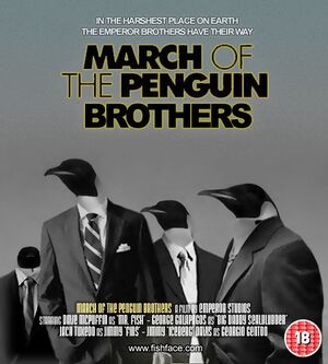
March of the Penguin Brothers: Hardwick's idea come to life.
- Thanks for the comments guys! I really appreciate the input. In particular, I might look to incorporate some of Zombie's ideas. But, I haven't really had the time to be Photoshopping recently. I might come back to it later on when I have more spare time and I've rethought the concept. Cheers. -- Hindleyite 20:02, 26 September 2006 (UTC)
- The Arctic is Under New Ownership. Anyone who has a problem with that should apply to "The Management", alright?
- Gang wars at the South Pole. The Penguin Brothers have taken on the infamous Crayfish twins. --Sir Hardwick Fundlebuggy (Bleat) 20:41, 26 September 2006 (UTC)
- OK, I want to revisit this. To the right is an idea I am working on and could possibly use. Couple of problems, though: I'm afraid people will be sick of film poster Potatochoppings, they might be a bit cliched. Second, I need some wittier captions or a funnier title, perhaps. Any further comments etc would be appreciated. -- Hindleyite 16:36, 30 September 2006 (UTC)
- He's still poking out too far. 07:50, 2 October 2006 (UTC)
- That is fantastic, Hindleyite, except now I'll have to start writing the article that goes with it. "Penguins. On the surface, they seem harmless enough - docile in fact - almost stupid. But look closer, and you will see that there is a criminal fraternity in the penguin group - a dark side to the waddling surface.". That's just to remind me of an opening before I forget - but I'll write the rest soonish... --Sir Hardwick Fundlebuggy (Bleat) 11:16, 2 October 2006 (UTC)
Ubermensch
- How about a slightly different take on it? -- Sir Mhaille (talk to me)
- I'd like Mhaille's with the U with umlauts... that'd be my wish on this one.--<<>> 20:01, 23 September 2006 (UTC)
- Yeh, Mhaille's version has a little something extra on the original... -- Hindleyite 12:46, 24 September 2006 (UTC)
- Once again Mhaille takes the kake. --Brigadier General Sir Zombiebaron
Etch-A-Sculpt
- Dunno where this came from. This'll be the last one for a while; Lego Star Wars II is calling me <take that, death star!>.--Sir Modusoperandi Boinc! 00:02, 20 September 2006 (UTC)
- Nice. Only one request: clean up the edges. There should be no white surrounding the black lines. --Brigadier General Sir Zombiebaron 19:28, 20 September 2006 (UTC)
- Done.--Sir Modusoperandi Boinc! 01:34, 22 September 2006 (UTC)
- Much better. Now, see if what other people have to say, cause I don't see anything else to improve. --Brigadier General Sir Zombiebaron 01:36, 22 September 2006 (UTC)
- Etch-a-sketch seems to be the subject of a few funnies at the moment..... -- Sir Mhaille (talk to me)
- It's Etch-A-Sketch, man! It's the human experience, wrapped in the red plastic case of hope that eventually leaks the silver shit of lost childhood around the yellow dials of experience.--Sir Modusoperandi Boinc! 13:09, 22 September 2006 (UTC)
- I believe that the kids today would say, "W00t!". Another grad of Reefer Desk.--Sir Modusoperandi Boinc! 02:34, 2 October 2006 (UTC)
- I laughed out loud at this one as is. But I'm easily amused - David Gerard 16:07, 3 October 2006 (UTC)
- That's my core demographic.--Sir Modusoperandi Boinc! 16:22, 3 October 2006 (UTC)
- I would take out the shadows in the David drawing. I don't recall having shadows on my etch-a-sketch drawings & my son doesn't have them on his either. I can understand the lines defining where shadows should be and muscle & so forth. The shadows to me just make it seem not so Etch-A-Sketchish. Other than that I like it. 17:09, 3 October 2006 (UTC)
- Since it was Etch-A-Scupt I added in the shading. Granted it's not realistic...but reality is highly overrated, IMHO, and it looked too flat with no shading. As it's turning a distinctly 2D toy into a 3D joke, I think it works.--Sir Modusoperandi Boinc! 17:17, 3 October 2006 (UTC)
- Ah, I see. 23:28, 3 October 2006 (UTC)
- Which is all moot anyway as I don't plan on tinkering with this pic anymore; it's featured, and I still get all twitchy when I remember drawing all of those frickin' right-angled "etch-a-sketch" lines (Post Traumatic Etch Disorder).--Sir Modusoperandi Boinc! 23:32, 3 October 2006 (UTC)
Red & Blue
- I found my old box of "Axis & Allies" and it gave me the impetus to finish a pic that's been floating around in my head for awhile. I think this also might be my mind revolting for my doing a rewrite for Annie. I tried to keep it as close to the original box's theme as possible, but most of the text was cut, as it was small on a three foot box and two or three pixels high on my computer.--Sir Modusoperandi Boinc! 05:41, 13 September 2006 (UTC)
- Whoa, man. That's some good collage work. Well done. There's something missing, though... can't place my finger on it. Perhaps see what it might look like with a bit of a plastic wrap, or at least made to look a bit more shiny, wrapped in that transparent material as if it were just bought from the shop. Plus, I dunno, but you might want to try making it look as though it was a picture taken for a mail-order catalogue - you know, jazzed up to make it look even better than the product actually is. Good job, though. -- Hindleyite 11:00, 13 September 2006 (UTC)
- I have to fix the flags when I get a chance. I'm still hunting for better pics too (I need one of a media scrum; instead of the overloaded soldier on the left)--Sir Modusoperandi Boinc! 13:05, 13 September 2006 (UTC)
- Ok, new version, with a bunch of little tweaks. Am I off my rocker, or is this not bad?--Sir Modusoperandi Boinc! 04:24, 14 September 2006 (UTC)
- New, new version...the additions are "faded" to match the contrast on the box...and while I'm here, I can't make it look better than the product actually is; it's freakin' Axis&Allies over here! It was the ultimate time waster for virginal geeks that were bored with Battletech, or so I've heard.--Sir Modusoperandi Boinc! 05:45, 14 September 2006 (UTC)
- I see. Perhaps people who have heard of the game would appreciate the humo(u)r more, but as a Photoshop, it's great. I think we're due for another featured picture sooner or later... -- Hindleyite 12:05, 14 September 2006 (UTC)
- I'll come back to it later and see if I've missed anything...I think it's good. Dunno if it holds up w/o knowing about Axis/Allies though.--Sir Modusoperandi Boinc! 13:11, 14 September 2006 (UTC)
- The main text on the front of the box needs to be warped for proportion, but on the side it's good. 00:21, 15 September 2006 (UTC)
- Yes, it's tough to do (as it, like all Axis&Allies boxes is both dented and warped). Most of the text needs more tweaking...I'll get around to it when I get a chance (Damn that warped "R" on the side!).--Sir Modusoperandi Boinc! 00:28, 15 September 2006 (UTC)
- V1.4..."undented" face of box, redid text and other minor tweaks (so minor I can't even see them).--Sir Modusoperandi Boinc! 03:24, 15 September 2006 (UTC)
- V1.5, changed "command" to "lead" to make the text fit the box better.--Sir Modusoperandi Boinc! 19:10, 15 September 2006 (UTC)
- v1.6, changed to a higher contrast version of the red/blue state america, swapped the flags on the left for a confederate & rebel flags + tweaked the US flags on the right for a period correct 34 stars (period correct flags for the US civil war, which seems appropriate, methinks).--Sir Modusoperandi Boinc! 14:42, 16 September 2006 (UTC)
- Methinks it is time to hand this over to the vultures at VFP... -- Hindleyite 11:06, 17 September 2006 (UTC)
- Sure, it's time to let it go, I guess. I don't see the voters on VFP as vultures; they're good kids, just a little rambunctious, that's all.--Sir Modusoperandi Boinc! 21:17, 17 September 2006 (UTC)
Tsar Wars
- I made this for El Zoof's Tsar Wars article, so he'd better finish it! I know all the details can't be seen unless it's full size (again) but I'm hoping that this time there is enough good stuff at a reasonable size to work. -- sannse<staff/> (talk) 21:17, 11 September 2006 (UTC)
- I don't get it... why are there 4 R2-D2's? --Mindsunwound: (NS) Pantsu Getta!
 Vacuum
  21:24, 11 September 2006 (UTC)
- [4] -- sannse<staff/> (talk) 21:31, 11 September 2006 (UTC)
- Then all but the smallest R2 should probably have a part-line across their bellies. Maybe have the biggest on open, too.--Sir Modusoperandi Boinc! 21:36, 11 September 2006 (UTC)
- Or would it be better to remove that? if it doesn't work... -- sannse<staff/> (talk) 21:46, 11 September 2006 (UTC)
- Put the line across the middle, and the one tht is smallest, split it open and show the top of an even smaller one inside...--Mindsunwound: (NS) Pantsu Getta! Vacuum 22:06, 11 September 2006 (UTC)
- you may want to consider replacing Leia with Katherine the Great and Luke with Yakov Smirnoff --Mindsunwound: (NS) Pantsu Getta! Vacuum 22:10, 11 September 2006 (UTC)
- This is a thing of beauty. -- Sir Mhaille (talk to me)
- Desperately needs a pic of R2D2 open to explain the Russian Doll joke; otherwise, this is excellent.--<<>> 13:21, 13 September 2006 (UTC)
- I've removed the extra R2D2s. After a few tries at opening one, I decided they are just too detailed but small to make this work. So I've decided they just have to go. -- sannse<staff/> (talk) 21:08, 15 September 2006 (UTC)
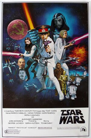
I didn't like to think of the R2D2 joke going, so I had a crack at it. Then I got into it and decided I didn't like Luke's hat - then Leia's scarf reminded me of a judge's wig so I drew her a nice new one. Then I made some saturation changes etc etc. I'll honestly do anything to get out of doing proper work. It looks best at full size - I noticed all the text jokes Sannse put in only when I looked at the bigger picture, so to speak. 11:35, 18 September 2006 (UTC)
Big Dubya
- The "blah" propaganda posters that have appeared on VFP recently lead me to try a satirical prop poster. I've been up for eighteen hours, so I can't tell if it's blurry, or if it's just me.--Sir Modusoperandi Boinc! 15:21, 9 September 2006 (UTC)
- Appears a little fuzzy.-- 15:25, 9 September 2006 (UTC)
- Been up for 18 hours? Dude, get some sleep and come back to it tomorrow! Big Dubya compels you. Seriously though, I quite like this, but not sure about the grey text... dunno, I'll come back to you later. -- Hindleyite 15:38, 9 September 2006 (UTC)
- White text, less blurry. Me go sleep now.--Sir Modusoperandi Boinc! 15:45, 9 September 2006 (UTC)
- Last tweak. This is getting my blood pressure up, if I continue it won't be satire anymore; it'll end up too true... I saved it as a different filename, as I don't know if it's moved from satirical-1984 poster to angry. In any event, I'm not touching it anymore. I'm going to do something else now (there's half a watermelon in my fridge, an' it has been looking at me funny).--Sir Modusoperandi Boinc! 04:02, 10 September 2006 (UTC)
- I think it kind of works with and without the WTC image, but the first one has a better balance. Good job in both cases, man. -- Hindleyite 13:47, 11 September 2006 (UTC)
- Yeh, the original is best. The tower version was the way I'd originally pictured it in my head. Plus it's the first time in a while that I've used a <gasp> pencil for art.--Sir Modusoperandi Boinc! 18:00, 11 September 2006 (UTC)
Dick Hunt
| Please Help this Picture
|
This classic NES shooting game not quite as popular as others in the same genre due to the difficulty differentiating between actual and decoy targets. Plagued by evangelical protests over the name of the game, and lawsuits over character assasination, the game was eventually recalled from shelves entirely. Image credit: mindsunwound
Nominate - discuss this image
|
|
- I think it's ready for VFP, but Modusoperandi said to put it through here first... --Mindsunwound: (NS) Pantsu Getta! Vacuum 20:46, 5 September 2006 (UTC)
- The "I" character of the "dickhunt" text is leaning to the right. There's also too much space between the "D"-"I"-"C" (since it's changed from a wide letter like "U" to the narrowest letter you might end up "kerning" (oops, lingo!) spacing the rest of the letters farther apart). The Cher pic doesn't match the "style" of the rest of the cartridge (although a pixelly Cher would probably be unrecognizeable). It might be better as a circa 1984 Cher vice the modern one. Also, as an aside, I'm not up on pop culture these days so excuse me for asking but...what's the joke here?--Sir Modusoperandi Boinc! 21:03, 5 September 2006 (UTC)
- The "Joke" is that Cher looks like a man in drag. Thusly when the player shoots the picture of Cher, and not the picture of the detective, they are indicating that Cher has a Dick... and they thusly recieve 10 points! Yay! --Mindsunwound: (NS) Pantsu Getta! Vacuum 21:13, 5 September 2006 (UTC)
- Ah...and I thought my shit was obscure. I've never thought of Cher as mannish. Or, to be more exact, I've never thought of Cher at all. It probably doesn't help that I don't remember Duckhunt.--Sir Modusoperandi Boinc! 21:21, 5 September 2006 (UTC)
- Who would you recommend as an alternative to Cher? Maybe Margaret Thatcher? --Mindsunwound: (NS) Pantsu Getta! Vacuum 21:35, 5 September 2006 (UTC)
- Maybe that Chyna Doll from Surreal Life... --Mindsunwound: (NS) Pantsu Getta! Vacuum 21:50, 5 September 2006 (UTC)
- Better Kerningded? --Mindsunwound: (NS) Pantsu Getta! Vacuum 21:33, 5 September 2006 (UTC)
- Yup. As for mannish women, Madeline Albright looks just like Winston Churchill. Sorry about the lingo. Fiddly details from previous careers pop out every once in a while. It still bugs me when people call "typefaces" "fonts", for instance.--Sir Modusoperandi Boinc! 22:42, 5 September 2006 (UTC)
- My main concern with that would be that it would become a political joke instead of a "chick with a dick" joke... --Mindsunwound: (NS) Pantsu Getta! Vacuum 15:45, 6 September 2006 (UTC)
- Maybe I should replace the detective? but who to put in instead? another singer? or maybe a guy... like Tom Cruise... indicating that Cher has more of a dick than Tom Cruise? jsut a thought... --Mindsunwound: (NS) Pantsu Getta! Vacuum 23:53, 6 September 2006 (UTC)
- Any more suggestions? or should I go ahead and try it at VFH?--Mindsunwound: (NS) Pantsu Getta! Vacuum 17:07, 8 September 2006 (UTC)
- As someone who doesn't get it I can't help you anymore either way.--Sir Modusoperandi Boinc! 19:25, 8 September 2006 (UTC)
- No offense, man, but I fear for this pic. If it were put on VFP right now I think it would be swallowed by the vultures. Usually, if someone doesn't get it then others won't get it either. That's just the way it goes. Quite a good attempt, though. -- Hindleyite 15:44, 9 September 2006 (UTC)
- What if I used a picture of Cick Cheney with a gun, some Quail, and a picture of that Wellington guy he shot? It would cease to be a CWAD joke, but more people might THINK they get it... --Mindsunwound: (NS) Pantsu Getta! Vacuum 20:29, 11 September 2006 (UTC)
The Mona Lisa 2
| Please Help this Picture
|
Hurt by critisism regarding Mona Lisa's lack of facial hair, Leonardo DaVinci painted the Mona Lisa 2, which was slightly less popular than the original. Image credit: Kaizer the Bjorn
Nominate - discuss this image
|
|
What do you guys think? I'm going for my 3rd FP here, and I thought about it around 1:00 AM so I'm not sure how funny it is to someone who's well rested. -- Kaizer the Bjorn takkun (nya nya) (1961 model!) Check out T61! 14:45, 4 September 2006 (UTC)
- I'd think it'd be more comical if she had a handlebar moustache like Paul Sr.. --~

Jacques Pirat, Esq. Converse : Benefactions : U.w.p.
17:17, 4 September 2006 (UTC)
- Actually, It might be a bit overdone, not that the concept is bad, Maybe instead of puttign on eyebrows and a beard, just do a little hitler moustache... then the humour is a bit more subtle, and you have the added bonus of the Hitler Joke Paradox Effect. --Mindsunwound: (NS) Pantsu Getta! Vacuum 15:48, 6 September 2006 (UTC)
- Hey, it made me laugh, and it's fairly slick, but as it stands, not sure about VFP yet. Trying the Hitler thing might be going into the realms of Uncyc cliches. Try giving her a handlebar moustache as per JP to see how it goes. -- Hindleyite 15:48, 9 September 2006 (UTC)
- Yeah, i didn't think the hitler moustache would go. i'll try the handlebar moustache. --{ Kaizer the Bjorn takkun (nya nya) (1961 model!) Check out T61! 15:56, 10 September 2006 (UTC)
I tried the handlebar moustache, but she still looked a little bare, so I added a goatee. -- Kaizer the Bjorn takkun (nya nya) (1961 model!) Check out T61! 13:47, 14 September 2006 (UTC)
- If she had pointy eyebrows, moustache and a l'il goatee, it could be her evil twin...perhaps that's o/t.--Sir Modusoperandi Boinc! 13:58, 14 September 2006 (UTC)
If you made the sideburns a bit wider and added some more touches, she'd begin to look like Lemmy from "Motorhead". Then you could call it the "Mona Lemmysa". Why you would want to do that, is another matter but it exists as a purely hypothetical possibility. --Sir Hardwick Fundlebuggy (Bleat) 14:06, 14 September 2006 (UTC)
- Wow, an artiste, author and head banger. Hardwick, you truly are a renaissance man.--Sir Modusoperandi Boinc! 14:13, 14 September 2006 (UTC)
Any criticisms and such of this image? --- Jaques Pirat IS NOT FRENCH! TP, F@H 01:02, 3 September 2006 (UTC)
- Looks pretty good, and it's a great concept. The EA logo is a nice touch, and so is the "John Madden's", although the John Madden text isn't entirely noticeable at first glance. The only things I would change would be to either center the character or add another character to the other side, center the logo, bring the EA logo down to the bottom, add a Square Enix logo, and make the 0 in '06 as tall as the 6. Maybe add some football helmets, make him hold a football, etc. -- §. | WotM | PLS | T | C | A 01:36, 3 September 2006 (UTC)
- Yeah, looks quite good. But, to make it even better, consider sharpening the image just a touch. Also, when viewed in full resolution, it looks as though the character has a sort of blue halo around him. It's not entirely evident at this size, but I would suggest completely eradicating this and blurring the edges of the character slightly. Other than that, it's looking good. -- Hindleyite 11:22, 3 September 2006 (UTC)
- I modified it following things requested by the requestee and you two. How's it now? --- Jaques Pirat IS NOT FRENCH! TP, F@H 20:03, 3 September 2006 (UTC)
- Yep, even better now. One more suggestion... is there any way you could adjust the letter spacing on the word 'football' to look more like the 'Final Fantasy' Text? And the bottom underline looks a bit thick. I think the extra character adds a bit of balance to the pic now and it's definitely progressing. -- Hindleyite 20:10, 3 September 2006 (UTC)
- Fixed --- Jaques Pirat IS NOT FRENCH! TP, F@H 21:07, 3 September 2006 (UTC)
- Here's a thought, if you're feeling ambitious: A picture of John Madden in the middle, carrying a gunblade. Just occurred to me. If you can do it, great; if not, the image looks good anyway.--Procopius 16:03, 4 September 2006 (UTC)
- Since the pic has been approved and used, I'm not going to reupload the new version with madden holding a gunsword until both my backup floppy drive is working and Bradaphraser approves. --~
Jacques Pirat, Esq. Converse : Benefactions : U.w.p.
22:40, 5 September 2006 (UTC)
- I like this one, but I'm certainly not opposed to trying to improve upon it. By all means, go for new takes on the idea: maybe a cover for an older version? Like, Final Fantasy Football 99 or something? You totally have my permission to do any weird crap you want.--<<>> 18:14, 6 September 2006 (UTC)
- Excellent! That's even better than I thought it would be. You had my vote for VFP; I'm gonna campaign for this now. OK if I nom it?--Procopius 13:21, 7 September 2006 (UTC)
- This looks da bomb now. Better than the Smash Bros. Volleyball thing. Might be a slight issue with the shadows, though. Try lightening the character on the right to see how it looks. -- Hindleyite 15:33, 9 September 2006 (UTC)
- Definately a bit better. That however is as far as I dare go to brighten him up. --~
Jacques Pirat, Esq. Converse : Benefactions : U.w.p.
00:25, 10 September 2006 (UTC)
Fiddy Scoop
Not my image, but found it and thought it hilarious.--Wit (tawk) 19:38, 31 August 2006 (UTC)
- Generally people submit images that they made themselves here. As you didn't make it, and would therefore have to rework this exact image, I'll warn you in advance that retouching a one layer pic can be a bitch, as you're essentially starting from scratch. From what little I know about Mr. Cent (he got shot a bunch of times, right?), either the box needs bullet holes or there should be bullets sticking out of the picture of ice cream. Or if the pic had the box sitting on a table, maybe scatter some shell casings around. The "Fitty Cent "It's good shit"" text should probably follow the flow of the label that's behind it as well.--Sir Modusoperandi Boinc! 09:43, 1 September 2006 (UTC)
- Hunh? No, I wasn't planning on altering it, I found it and wanna know if it's funny enough to feature
- So is it funny?--Wit (tawk) 23:51, 1 September 2006 (UTC)
- To me, not really. But I don't like the music that you kids listen to these days. Others here may have a different opinion.--Sir Modusoperandi Boinc! 00:57, 2 September 2006 (UTC)
- Well, my family buys Breyers all the time, so this was instantly recognizable, I'll go put it up.--Wit (tawk) 03:18, 2 September 2006 (UTC)
- You have to have made it yourself for it to be featured, sorry. 18:17, 2 September 2006 (UTC)
- This was actually just a quick edit I was using for a placeholder, until I got around to making a better one. A few months later, I've yet to even open the file again, but it'll come in due course.Masterskill 19:57, 24 September 2006 (UTC)
- Ah, right, what I should have said was the image needs to be unique to Uncyc to be featured - when Wit said he found it I thought he meant on the web. 07:55, 25 September 2006 (UTC)
Tarim Mummy
| Please Help this Picture
|
A Tarim Basin mummy.
This Caucasoid mummy was excavated in the Tarim Basin, (upper Silk Road, now political China) in 1910 by Sir Macaca Smith. DNA tests on samples from the mummy confirmed that it had European genes: proving Sir M. Smith's controversial hypothesis that Caucasoids had once rushed up the Silk Road to civilize savage Mogoloids and swiftly returned Image credit: Mowgli
Nominate - discuss this image
|
|
.
- any good? suggestions please. -- mowgli 09:24, 26 August 2006 (UTC)
- The blacks in the background picture are too light compared to the, ahem, black of Al Jolson. Try either darkening the background (you may have to kick up the contrast to compensate) or lighten Jolson. A little blur on Al would clear up the jaggies (or use a higher-res pic of him instead). I hope this is for some sort of political satire, as blackface references tend to raise the blood pressure.--Sir Modusoperandi Boinc! 14:15, 26 August 2006 (UTC)
- Basically, what Modus said. You might need to balance out the contrast a bit, and perhaps find a better, higher res image to 'shop from. -- Hindleyite 14:20, 26 August 2006 (UTC)
- excellent suggestions! darkening the background is preferable 'os blackfaced-al lightened will lose recognition. starting with a high res. pic. and blurring it makes sense. well yes, it is political satire (racial politics). the "tarim mummy" *is* considered closeR to european genes but the argument is circular, or, ahem, circulus in probando, because there is no standard "european gene" and in the above it is defined by the argument's circular reasoning; then again, if the mummy's genes are "closer" to something (something "genetically" not standard or universally accepted as one yet), then what is it "farther" from? etc. in one genetic survey conducted to establish "white american genes" to build "model" amerindian genes 'cos most of the former seemed too have some of the later (this was a state study necessary for some US federal benefits, affirmative action or something issues), white europeans were randomly sampled (to compare them with white americans) and some french volunteers were shocked to learn that they had amerindian blood! it was explained away with something harking back to the huns' invasion of europe. returning to the pic., black faced al johnson is also a circular argument - is he black? is he white (i sound so much like michael jackson these days...i wonder if mike'll be a better substitute to al?). to cut a long story short, yes this is (racial) political satire. -- mowgli 15:43, 26 August 2006 (UTC)
- Whew! <wipes beads of sweat from forehead> Good, it's satirical. It probably looks better as part of a page...what page? Just remember that without text it looks like something my relatives would take to the rally (hint: some of them are really good banjo players, others keep stealing my white sheets. Fucking rednecks.)--Sir Modusoperandi Boinc! 16:00, 26 August 2006 (UTC)
- LOL. aside: let me wrap my above comments wickedOpedialy - the fact is that there are little or none "genetic" markers distinguishing races (yet). but, yes, people do look different -- it's obvious. "genetically" -- to reiterate -- this isn't so. what led people to believe that the tarim mum. was caucasoid was it's blonde hair. down the line they realized that dyeing a mummy's hair was a part of the ancients' complicated rituals that consecrated the mummified dead. but the belief/pursuit was too entrenched by now in historian-scholars' minds to be swayed by this little(?) discovery. thus the satire. historian-scholars masturbate too much. (well i do too -- but not often enough!!) -- mowgli 16:29, 26 August 2006 (UTC)
Oscar's Seen It
- I made this for the Waking Life article; those who've seen the film will probably appreciate it more. I made an entirely new Oscar face to overlay over the face of Wiley Wiggins, or whatever that kid's name is, and after all that work I realized that it probably would've been so much easier if I had just captured a screen shot of the director, Richard Linklater, in the scene where he discusses Philip K. Dick over a game of pinball, because he looks pretty much the same. 'Shop and learn, right? So anyway, the pic really isn't laugh inducing on its own — what's it need? -- Imrealized ...hmm? 01:33, 18 August 2006 (UTC)
- In the context of the article, it works very well. Nothing really wrong with it, I think, but I might want to see a little more action in an overlaid picture like this (kind of like the equally funny Pee Wee Herman picture in the same one). Maybe Oscar singing with that band in the film? Or lying back and talking to a girlfriend? Just random thoughts.--Procopius 01:50, 18 August 2006 (UTC)
- I suppose there is no feasible reason to limit it to a scene from Waking Life at this point — I could just as easily take his head and place one of any possible worlds around it, let it evolve. But I don't know if I'll get into all that, unless something really brilliant comes up. Although having him lying in bed with Noel Coward is always a possibilty. -- Imrealized ...hmm? 02:00, 18 August 2006 (UTC)
- Would other Uncyc staples sitting in the theatre behind Oscar be worth the effort, or is that idea also becoming cliché? -- Imrealized ...hmm? 17:36, 19 August 2006 (UTC)
- I suppose it depends on how much work it takes to create each character. Wilde+Mr T+Yakov Smirnoff+Oprah might be a happy medium, but 10 characters would probably be a lot of extra work, for not that much extra funny. How many people were in the real scene? If it's one, then just having the master of memes is the way to go.--Sir Modusoperandi Boinc! 08:29, 24 August 2006 (UTC)
- Yep, original scene is this [5] so I suppose that it the way to go. Plus, I like the starkness. Maybe. I'm still up in the air on this one. -- Imrealized ...hmm? 16:56, 26 August 2006 (UTC)
Blackbeard Catering Company
- This was my first attempt at manipulating an image, using MSPaint (yeah, I know). It's an edited version of Blackbeard's flag. Not really looking to get it VFP (I don't think it works outside the article); just curious if others think this looks like an actual image or a clumsy edit of an earlier one.--Procopius 14:07, 1 August 2006 (UTC)
- Wow, that's MSP? Who's pulling my leg? It's good, it's just awfully complex for a flag. A wedding cake and crossed martini glasses would probably be more realistic. Wait, this is Uncyc, right? Did I say realistic. Now where did I leave my head? Modusoperandi 15:35, 1 August 2006 (UTC)
- For a MSPaint image, it is quite good. If all you're wanting to do is illustrate the Blackbeard article as you mention, then I think this probably works well enough as it is. In the context of the article alongside the other image it's pretty funny. You could perhaps make the objects in the skeleton's hand more obvious. Whilst you can tell he has a glass in his right hand, it could do with having a flash of black on it to show where the light is hitting it, or even a cocktail stick protruding from it. You could put something else in his left hand, perhaps a waiter's tray. This, of course, is all minor, as on the whole I think it functions as is. It's those little things that go together, however, to make a good image a great one. --Hindleyite | PL | GUN | WOTM | Image Review - Use it | Converse 15:39, 1 August 2006 (UTC)
- Good ideas, thanks! This is already flying in the Blackbeard Catering Company article, though I'm pleased to see that someone finally got around to doing one on Edward Teach himself.--Procopius 15:45, 1 August 2006 (UTC)
- Yes, looks good now. --Hindleyite | PL | GUN | WOTM | Image Review - Use it | Converse 10:14, 2 August 2006 (UTC)
- I think the heart is a little fugly. -- SonicChao Babbel!Contribs 11:17, 4 August 2006 (UTC)
- It was; I fixed it. Whatcha think?--Procopius 13:09, 4 August 2006 (UTC)
- Ah ha, very good now. -- SonicChao Babbel!Contribs 19:27, 4 August 2006 (UTC)
Barnyard Mayhem
- This may be a bit unusual, but instead of having one image at a time to be critiqued, I have two under one heading. Hope I can do that. These images go together, though. They are for The Battle of Chickens article. Any suggestions would be wonderful. so sayeth Sliferjam ~ Talk * Sock * Jam * Gallery * Fearless Fosdick?
 21:32, 30 July 2006 (UTC)
- The AK would look better with shading under the stock and fore-grip and hi-lite near the top. It doesn't have to shine but, if I remember those pesky communists, both were "curves" rather than flat. I dig the egg grenade (deeper shading under the pineapple "bumps" & lightening above wouldn't hurt. See toy pineapple grenade). Modusoperandi 21:49, 30 July 2006 (UTC)
- Much improved. A little shading goes a long way, even if it is a bitch to apply. Modusoperandi 02:46, 9 August 2006 (UTC)
- The egg grenade thing is a bit obscure. It's supposed to be an egg, right? How about a fried egg or in an egg cup, that would help. The AK is good, weird, but good. In other advice though, since you asked, your sig is the most hideously painful thing I've ever had to behold, and that includes EuroiPods and Jade Goody. FreeMorpheme 16:05, 14 August 2006 (UTC)
- ...I may have led you astray by telling you to make the grenade more pineappley. If so, my bad. Modusoperandi 16:17, 14 August 2006 (UTC)
GVG: Grue Vs. Grue
- bubba.txt. After the Yoda-Grue incident, I decided to try and redeem myself by making a freaking sweet image. Me thinks 'tis goot. Eh? Sliferjam - #1UN - You got something to say? - JAM! - I'm special. 21:32, 13 July 2006 (UTC)
I hope I'm doing this right... Two words; "Image Quality". --
02:31, 14 July 2006 (UTC)
It's not bad, especially the predator, but I would lose the little Alien tongue, and also shave off a few mill from the right hand side of the screen to even it up. Also, the text needs work, it's not up to it. And there's an apostrophe in We're... FreeMorpheme 08:17, 14 July 2006 (UTC)
- Another Alien vs Predator image? Well, uh, I dunno if people might be sick of grues. The Yoda Grue got away with it because it was just so good, but this might take the biscuit...
Anyhow, aside from this, a pretty good start. I think the text needs to be made more prominent as per FreeMorpheme's suggestions, consider rethinkning the composition. Also, try smoothing down the edges of the 'creatures' using a blur tool to make it blend in better with the background. But yeah, looking good so far. --Hindleyite | PL | GUN | WOTM | Image Review - Use it | Converse 09:52, 14 July 2006 (UTC)
- Weird, suddenly I want a plush Predator. Adorable! But, on topic: Hindleyite's pointing you in the right direction, and the alien might be better in the alien color, vice the grue one. Modusoperandi 09:59, 14 July 2006 (UTC)
- It's better now, except for the text (See how the text looks in this?). Even if you improve the text I think you'll have some problems if you try to put it on VFP. Apparently the world is tired of all things Grue. You're not, I'm not, a few others aren't. Most, however, are. Good luck, anyways. Modusoperandi 07:04, 16 July 2006 (UTC)
- I would still consider moving the text and the Alien over to the left a bit so you can chop off some of the right hand side to even up the framing. FreeMorpheme 21:18, 16 July 2006 (UTC)
- Hey, I fixed it. What now? Maybe crop it a little on the left? Sliferjam - #1UN - You got something to say? - JAM! - I'm special. 20:56, 20 July 2006 (UTC)
- Better, the text would probably be better centered between the characters. Modusoperandi 01:04, 23 July 2006 (UTC)
- Yes, the text is now miles better. Have you made an article for this pic yet? --Hindleyite | PL | GUN | WOTM | Image Review - Use it | Converse 09:59, 27 July 2006 (UTC)
Not yet, but I will soon. so sayeth Sliferjam ~ Talk * Sock * Jam * Gallery * Fearless Fosdick? 13:44, 27 July 2006 (UTC)
- A good article would bring this to some peoples' attention, and who knows... it could be put on VFP. --Hindleyite | PL | GUN | WOTM | Image Review - Use it | Converse 09:25, 17 August 2006 (UTC)
American Imperialism
| Please Help this Picture
|
Though the United States' new strategy in Iraq has proven effective at routing insurgent rebels, it has done little to relieve the stigma of what many percieve as American imperialism. Image credit: thetoastman
Nominate - discuss this image
|
|
A man, a plan, MS Paint, PHP! --Thetoastman 05:51, 4 September 2006 (UTC)
- We don't normally put flags on military equipment. I'm in the Army...but we wear flags on our uniform and they look backwards, so the field of blue stars is on the right, in the direction of travel of the vehicle. It simulates the flag waving in the wind. The walkers look too bright compared to the buildings, I don't know if that matters too much, you'll have to get some more qualified people. The Death star actually in the atomsphere of the planet is crazy...maybe get some tie fighters or something.-- Sir Severian

 (Sprich mit mir!)
  13:43, 4 September 2006 (UTC)
- You might want to consider using little Thigh Masters instead of TIE fighters... a little more tongue in chicle.... --Mindsunwound: (NS) Pantsu Getta! Vacuum 15:52, 6 September 2006 (UTC)
- Yeah, the Death Star is a little too conspicuous. The flags don't bother me so much, but accuracy makes anything funnier, so I bow to Severian on this. It's pretty funny, though. Make those tweaks and I think it will be ready for VFP.--Procopius 13:50, 4 September 2006 (UTC)
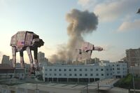
Radical X's second take, using thetoastman's sources.
- In addition, there's a shading/contrast mismatch on your source images that needs to be corrected to make them blend a bit better. I love the concept, but the execution could be better, for sure. Rad 18:56, 5 September 2006 (UTC)
- Something like this image, maybe. Rad 20:17, 8 September 2006 (UTC)
- I think I said what rad said, but not in such fancy terms...he is the one more qualified than me.-- Sir Severian (Sprich mit mir!) 19:25, 5 September 2006 (UTC)
You don't need to get rid of the Death star entirely, i think it would be cool if you set the blend mode to linear dodge(or similar) and make it look like it was outside the atmosphere. of course, you would have to tweak it a little, but the efect is striking. -- Kaizer the Bjorn takkun (nya nya) (1961 model!) Check out T61! 03:01, 7 September 2006 (UTC)
I'd say loose the deathstar completly on both pictures, and you've got a winner...-- Brigadier Sir Mordillo  GUN UotY WotM FP UotM AotM MI3 AnotM VFH +S 15:29, 9 September 2006 (UTC)
- I say keep the Death Star, but blend it behind the clouds, like when you see the moon durin' the day. -- 15:35, 9 September 2006 (UTC)
Dunno why, but whilst RadX's version is good, I prefer the original for some reason. I think both would go together well in an article about it. -- Hindleyite 15:51, 9 September 2006 (UTC)
Here's the version without the Death Star. As much as I'd like to do things like translucence and blur effects, my low-tech toolset can't quite muster it. The placement of the Death Star, too, was intentional- with the angle of the shot, if it had been high enough to be behind the clouds, it might not have been directly over Iraq, and I wanted to get across a massive amount of firepower converging on a small area. Regarding the flag direction, you make a good point Severian, but I think that most viewers wouldn't know that beforehand, and would therefore wonder why the flags were backwards. RadX, I really like your version, too- the lighting is infinitely better than mine, for starters- but there's a few things about it that bug me: the composition is a bit odd, the vehicles are small and a bit oddly placed- the whole left side is blank and the TIE fighter looks a little awkward at the corner of the smoke. I designed my picture to be intentionally simple. Instead of trying to include all the elements I could, it's more like a television camera shot. It's designed to be up to the viewer to imagine whether there's a wing of TIE fighters or an AT-ST being peppered with AK-47 fire just off-camera. -- cdr. thetoastman  tlk ctr cun f@h 08:00, 10 September 2006 (UTC)
Oh, yeah, and source images are here and here. I didn't save the AT-AT source file and I can't remember where I found it, but it was a less blue version of this. -- cdr. thetoastman tlk ctr cun f@h 08:07, 10 September 2006 (UTC)
- The new version sans Death Star is good apart from one thing - The city skyline is too soft compared to the walkers (or the walkers' outline is too sharp compared to the city). ~ Ghelæ talkcontribs 14:33, 10 September 2006 (UTC)
- Above, I've posted a new version using thetoastman's sources. If this goes VFP, thetoastman should be credited. Rad 13:41, 11 September 2006 (UTC)
- I think it looks great now the contrast issue is fixed and it has the original, stronger composition. -- Hindleyite 13:57, 11 September 2006 (UTC)
- The original Death Star was designed to destroy entire planets, which seems a little bit of overkill if you only want to wipe out Baghdad. What you want is the Death Star II, which would have had city-destroying capability. Of course, it was never finished. I'll get my coat. 20:47, 11 September 2006 (UTC)
- RadicalX, your new version pwns mine, very nice. If only I had Potatochop... ah, well. Do you think it's ready for VFP? -- cdr. thetoastman tlk ctr cun f@h 22:19, 15 September 2006 (UTC)
Star Wars: A Very Special Edition
- I woke up this morning with a scrap of paper, on which was scrawled, "Vader vs. Lollipop Guild". I hope this is whatever it was that I meant. The "Oz" background was a promo card (hence the text on the bottom). Is it legible to you? Are the sabers recognizable as sabers? Am I losing my mind? ...and why are black and white pics harder to 'shop than colour ones? Modusoperandi 00:51, 26 July 2006 (UTC)
- I tweaked already, it's textless now and I added pop to the lollipop guilds' sabers. It just looks better. Still deep into weird territory, but better. Modusoperandi 08:48, 26 July 2006 (UTC)
- My only thought is that it appears as though Vader's about to fall over....Other than that, good editing and pretty darned funny! Strong Rad 19:27, 26 July 2006 (UTC)
- It's a perspective thing, methinks. Or he's drunk. I'll see if I can sober him up a little. Modusoperandi 21:58, 26 July 2006 (UTC)
- The problem is the exaggerated perspective of the original Vader pic. I tipped him to the right five degrees: he appears only mildly drunk now. Modusoperandi 22:11, 26 July 2006 (UTC)
- Vader's angle doesn't bother me one bit. It reminds me of him clunking off the table in Episode Three, all Frankenstein-like. Or perhaps one of the Lollipop Guild hit him up with a little Force Bitchslap. Another great image (the quality around the Desk just keeps increasing). -- Imrealized ...hmm? 05:03, 27 July 2006 (UTC)
- Thanks. There's a little geek in me that sneaks out sometimes...and leaves notes for when I wake up <shudder>. At least I don't wake up on the floor anymore. Modusoperandi 05:32, 27 July 2006 (UTC)
- Meh, for some reason, I don't get it. -- SonicChao Babbel!Contribs 11:08, 4 August 2006 (UTC)
- We're disagreeing again. Hurrah! Modusoperandi 14:22, 4 August 2006 (UTC)
Fiddy's Brain
.
- I made this for Rap (currently on VFH, Diddy said for me to tell you to "vote or die", but that guy likes to exaggerate anyway) and decided to post it because it is as far on the other side of the spectrum from my last posting here that I could get. What'dya think? -- Imrealized ...hmm? 22:51, 23 July 2006 (UTC)
- Lots of decent gags in there, great image. The only complain from me is the size of the text, if you made it just a little bit bigger..... -- Sir Mhaille (talk to me)
- Better? What say you? Did I jaggy despeckle it too much? That Fiddy is a smart, smart man. -- Imrealized ...hmm? 00:41, 24 July 2006 (UTC)
- Much better. Although I had actually thought that his brains were located in a different part of his anatomy. :) -- Sir Mhaille (talk to me)
- Not much to say about this one, except I think it functions perfectly well as is. Particularly like the 'shorties, birthdays' bit. --Hindleyite | PL | GUN | WOTM | Image Review - Use it | Converse 11:26, 24 July 2006 (UTC)
- Thanks guys; glad the text looks better now. I was surprised myself to discover he had a brain at all, albeit one that is considerably scaled down, increasing its aerodynamics or flow. Unless anyone else has an idea on how to better this further, feel free to archive it so as not to take up space. Thanks again. -- Imrealized ...hmm? 12:02, 24 July 2006 (UTC)
Frozen Britney
- This image doesn't do so well blown up. I explaned some of the problems I had in the image's discussion page. I have a problem with MS paint changing the shades of some my pixels after I save. It's very annoying. Should I use a different program, and what should I use (for example, if a more experienced image editor told me what program they used, it might help me get better).--Hrodulf 21:37, 21 July 2006 (UTC)
- Most seem to use Photoshop. I use an ancient copy of PaintShopPro. None use MSPaint. Modusoperandi 21:54, 21 July 2006 (UTC)
- Er, Bermuda Triangle, a featured image, is made of MSPaint. Marshal Uncyclopedian! Talk to me!
- Well, thats true, but, it was intentionally supposed to be crappy, I think. -- Sir Mhaille (talk to me)
- I gots me some Corel going on, but I hear if you let the Gimp from out his box, he'll help you manipulate all the leathery images you like. -- Imrealized 00:10, 22 July 2006 (UTC)
- I have a little bit of photoshop experience, so I'll try that first. Thanks. --Hrodulf 00:58, 22 July 2006 (UTC)


![[1]](http://www.geocities.com/dagonet_uk/madron02.gif)
![[2]](http://ftp.lammhults.se/photos/products/72dpi/atlas_round_table/atlas_round_table_01.jpg)
![[3]](http://www.ugo.com/channels/filmtv/features/kingarthur/images/kingarthur_7.jpg)
![[4]](http://arts.anu.edu.au/languages/russian/russian_dolls.jpg)
![[5]](http://i63.photobucket.com/albums/h155/leguldur/Wakinglife.jpg)